CUKIERNIA
CZARODZIEJ
Bakery
with heritage
Czarodziej (The Wizard’s Bakery) has been making the same pastries, the same way, for longer than anyone can remember. The bakery approached us to help bring fresh energy to the brand while preserving its unique character.

Scope of Work:
RESEARCH
REBRANDING
-> Logo redesign
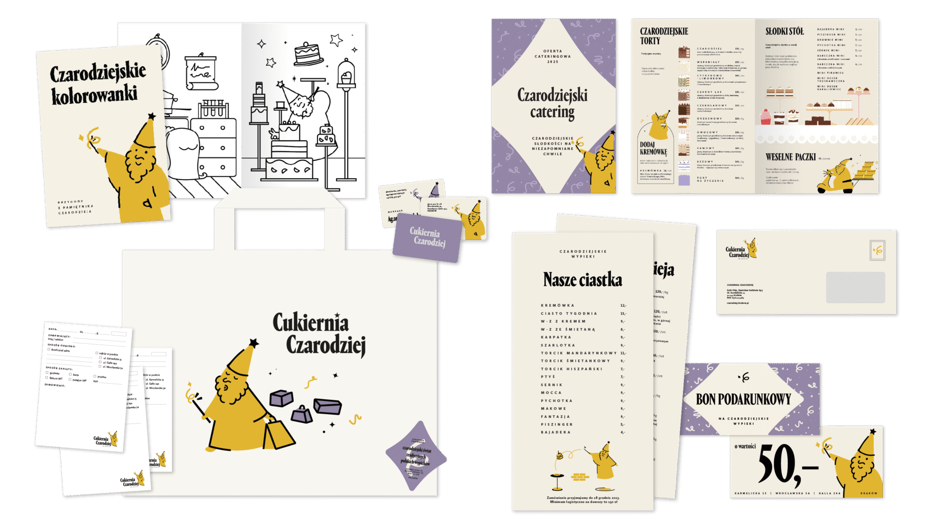
-> Key Visual & branding
-> Character design
IMPLEMENTATION
-> Packaging & stickers
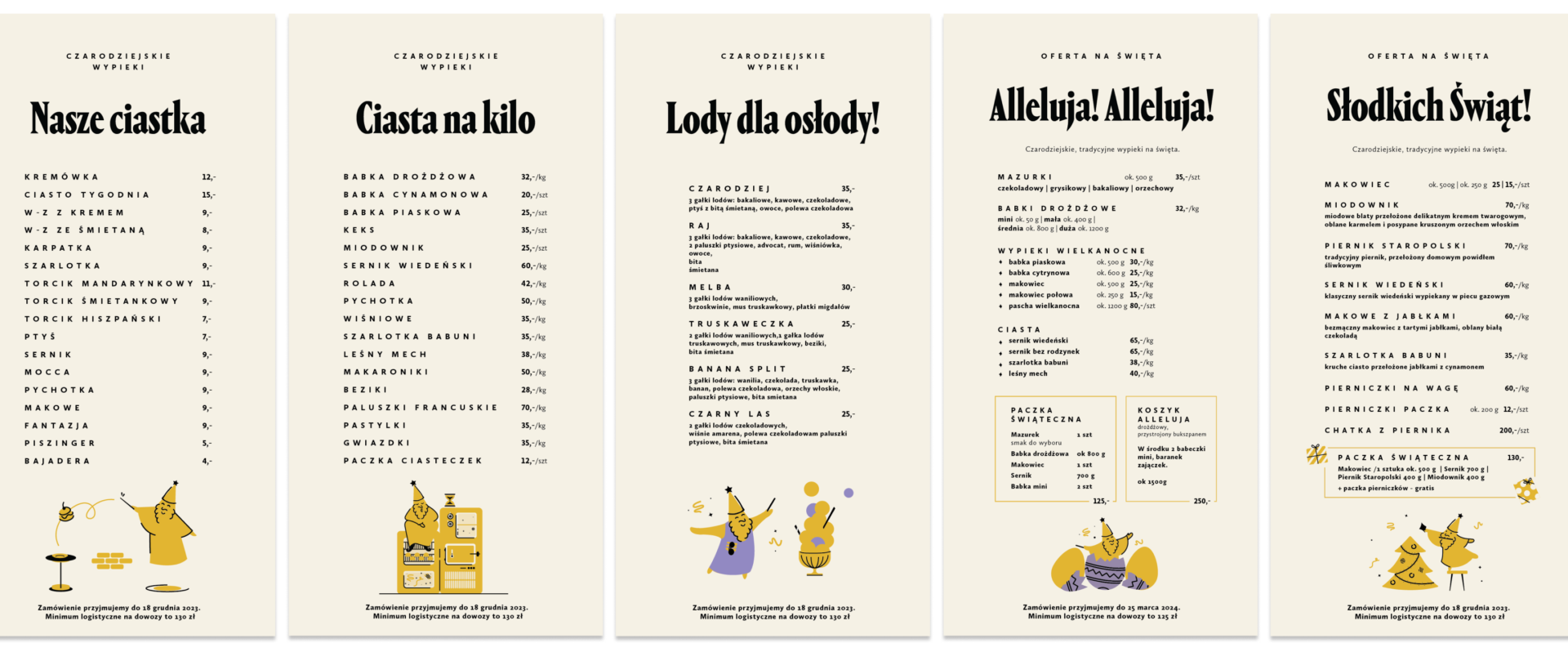
-> Menu
-> Flyers, Offers, etc.
INTERIOR ALTERATION
-> consulting
-> dedicated wallpapers
-> dedicated collages
-> mural
-> bar design concept
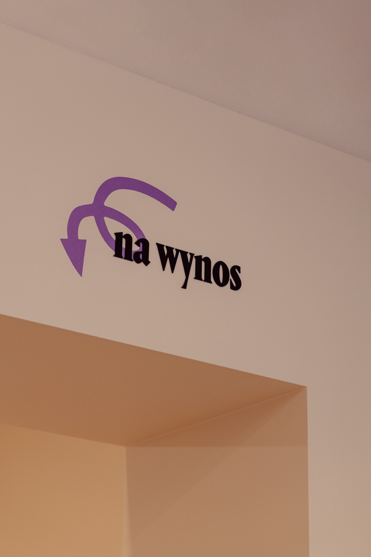
SIGNAGE & WAYFINDING
PHOTOSHOOT ART DIRECTION
SOCIAL MEDIA templates
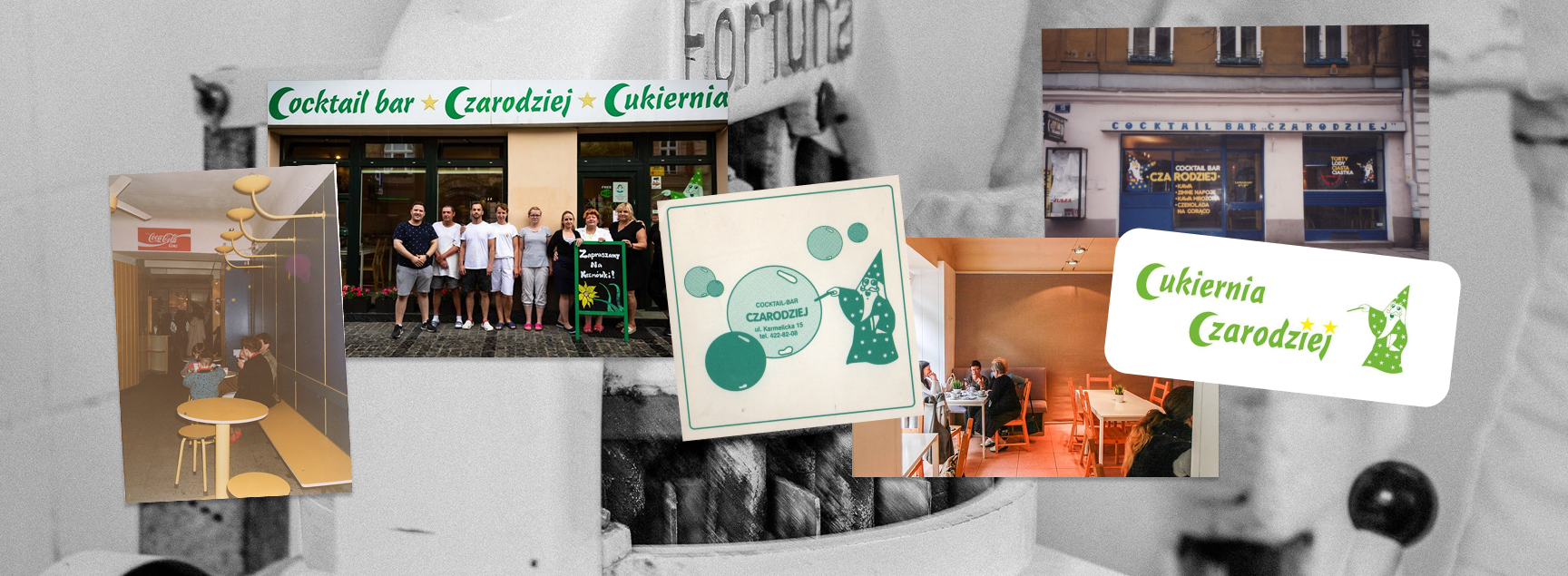
The challenge was to keep the heritage while making sure the next generation could find their way in.
We introduced changes slowly, testing each one with the regulars before moving forward. For us it was obvious — Czarodziej is one of the few places in Kraków where older people genuinely feel at home. Not tolerated, but welcomed. That was the value we wanted to protect.


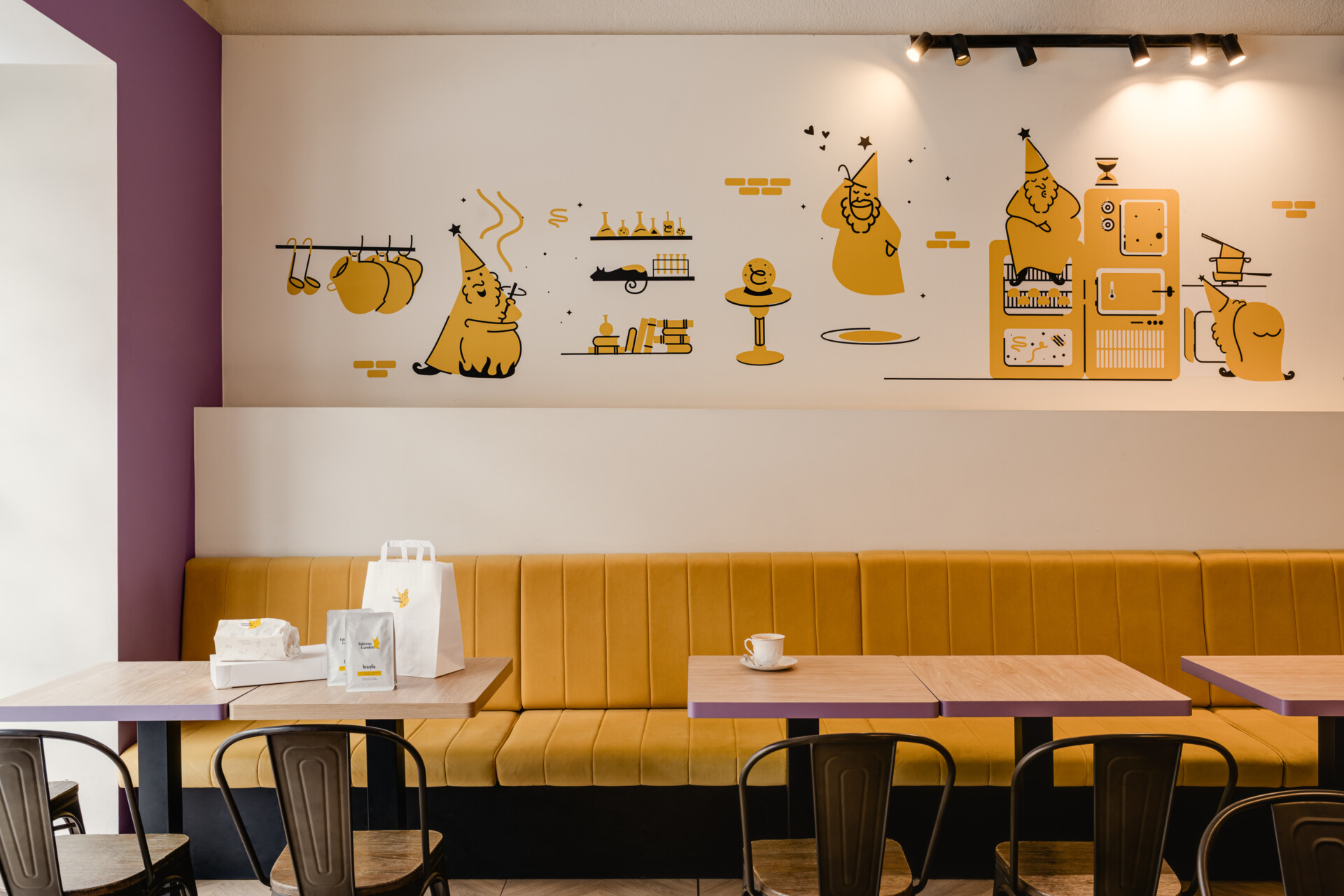


Branding comes alive in the interior, carrying the story and paying tribute to the bakery’s heritage.
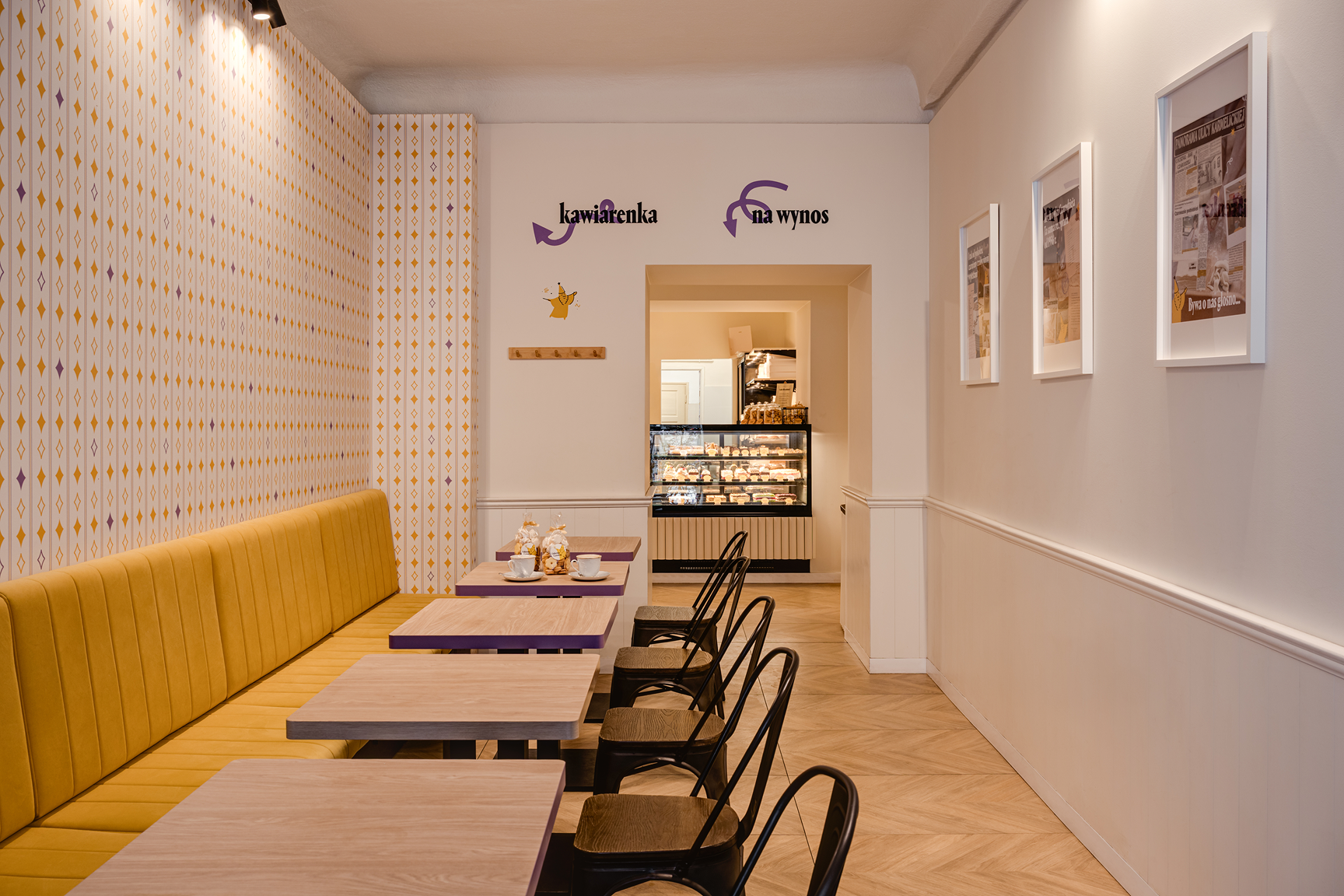
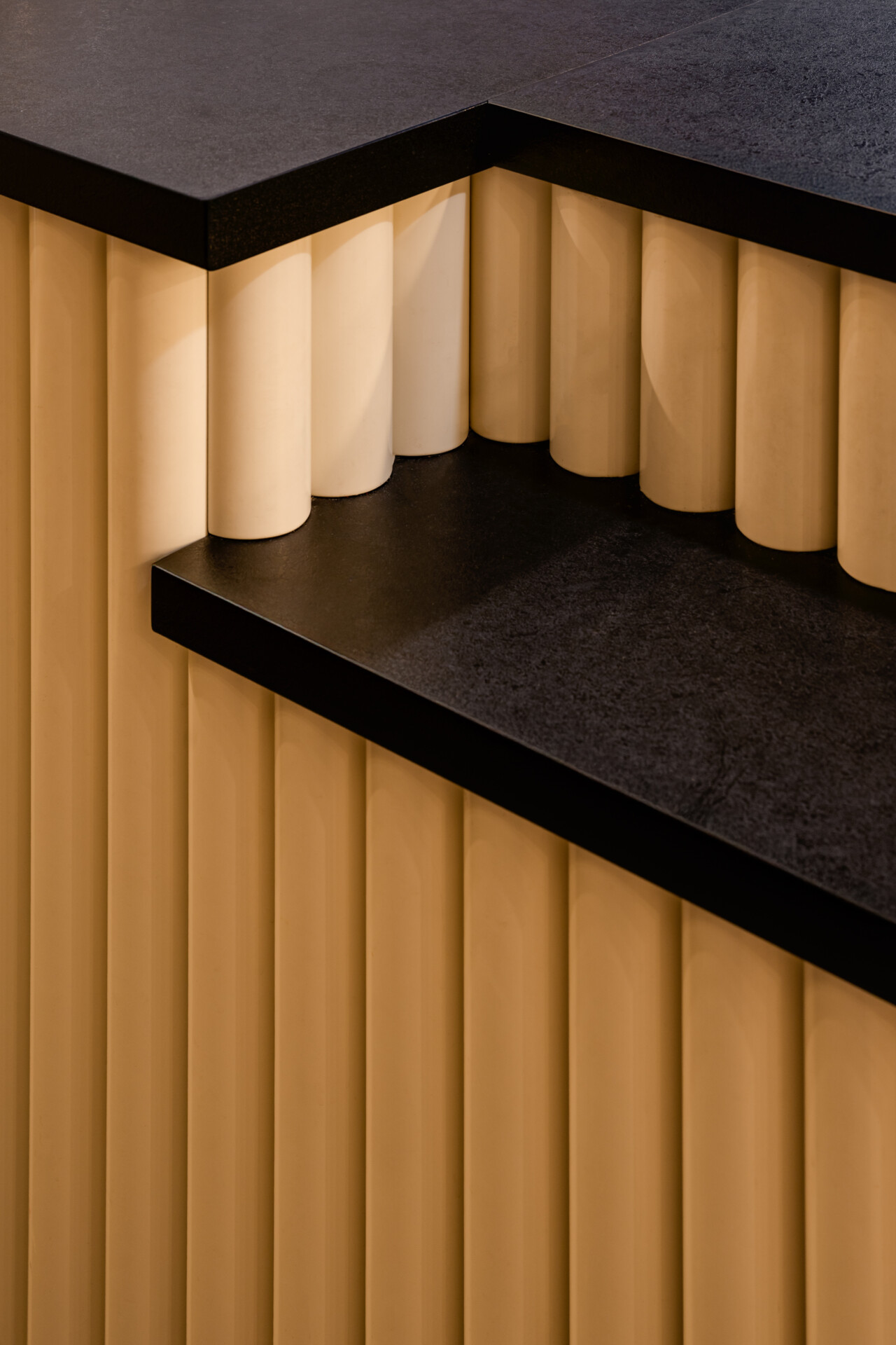
Warm yellow and soft violet lit up the space, making it cosy and inviting. Dedicated wallpapers revisit a traditional Polish grandma’s home, rhythmic patterns redrawn through the new identity. Small wizards scattered throughout give the space its host — welcoming guests, watering plants, pointing the way. The bar, designed specifically for Czarodziej, has its fluted wood panelling echoing the vertical rhythms of the wallpaper, adding a rounded, delicious accent.





CREDITS:
Branding & Art direction: Dawid Prząda & Paulina Suchińska
Photos: ONI Studio
hello@widok.studio
next up…