CIAO PASTA
BAR
Bringing the fine dining experience to the streets.
Pasta alla forma, with not-so-white but bright yellow gloves, brings the same craft and spectacle into a new context — taken outside, given new meaning while being lived and experienced in motion.


Visual Identity for Ciao Pasta Fresca
RESEARCH
VISUAL
STRATEGY
VISUAL IDENTITY
Logo
Key Visual
Graphic elements
Gifs
Illustrations
IMPLEMENTATION
Menu
Menu board
Signage
Uniforms & merch
Interior elements
Technical preparation
Brand Manual
Animations
We love simple associations transformed in unexpected ways. A fluorescent interpretation of the yellow hues of pasta and cheese. Stainless steel designed for kitchens, brought to the front. Vibrant holo foils, plexi, neon and other unexpected materials — creating a language that feels modern, confident and immediate.
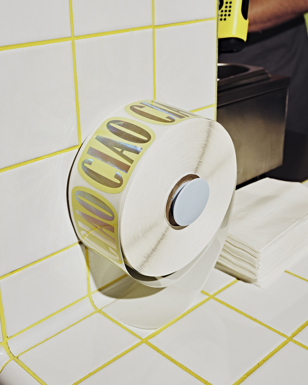


Built around a takeaway format, we created the box as a central part of the experience. Designed to carry and enjoy a high-level food experience, to be shared and photographed, and to be spotted from across the street.


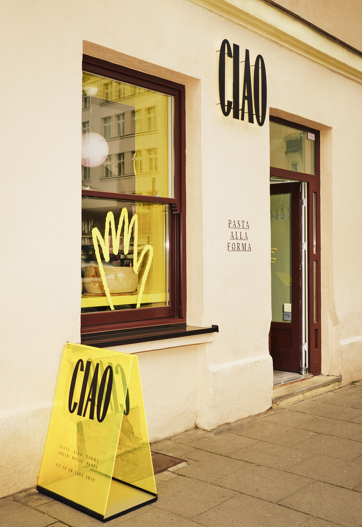

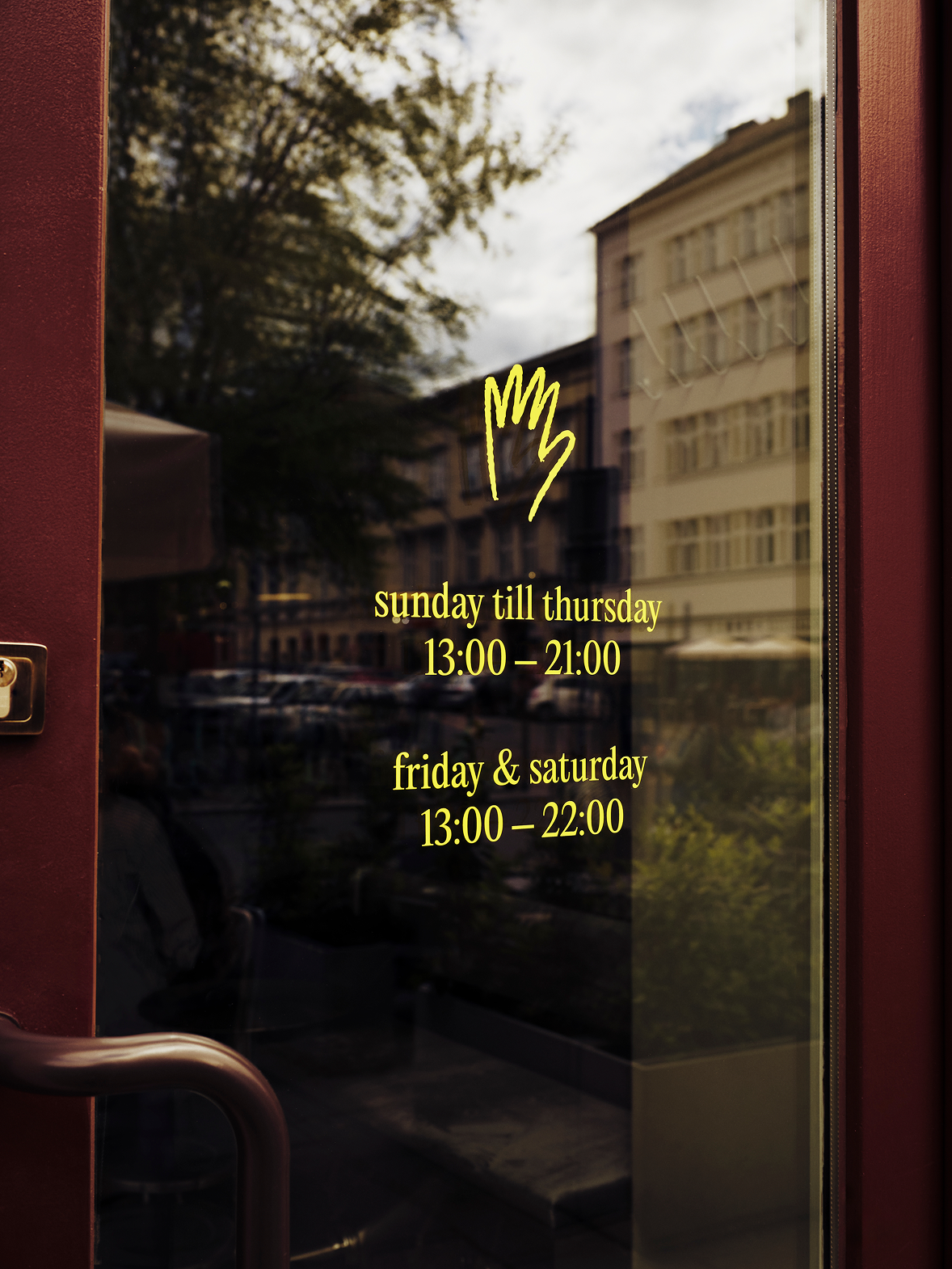

Details matter.
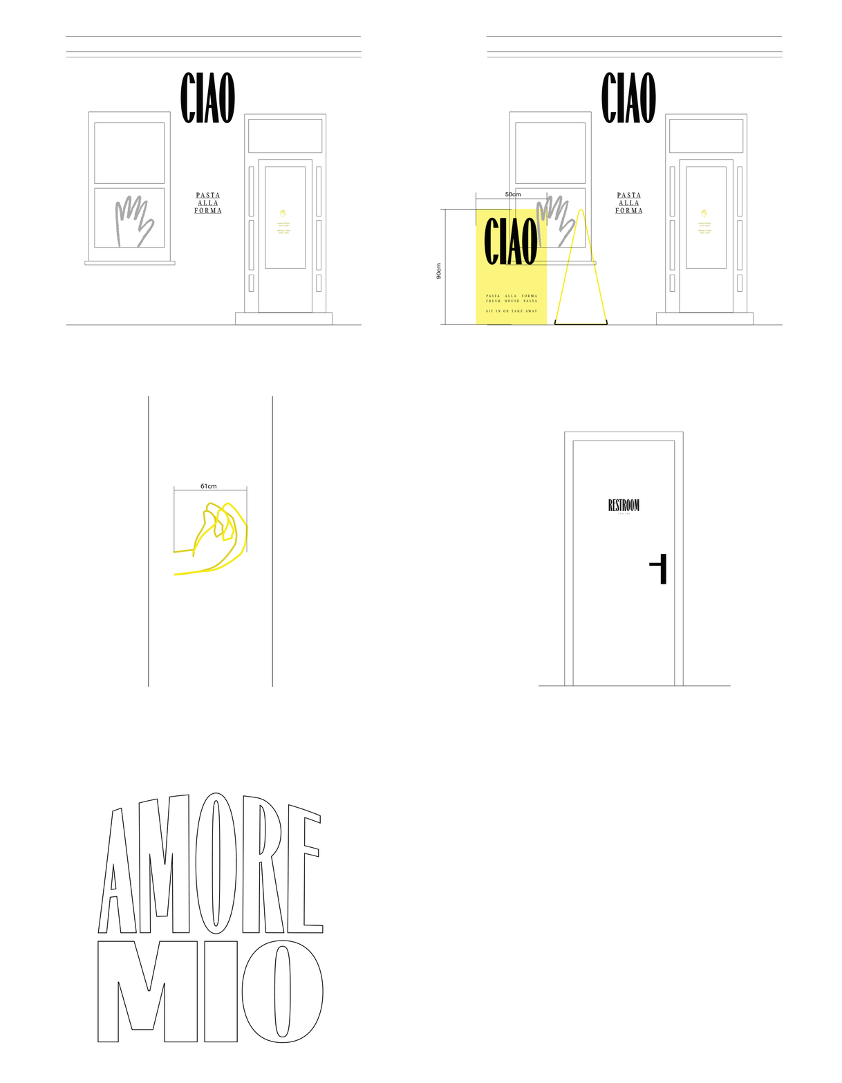
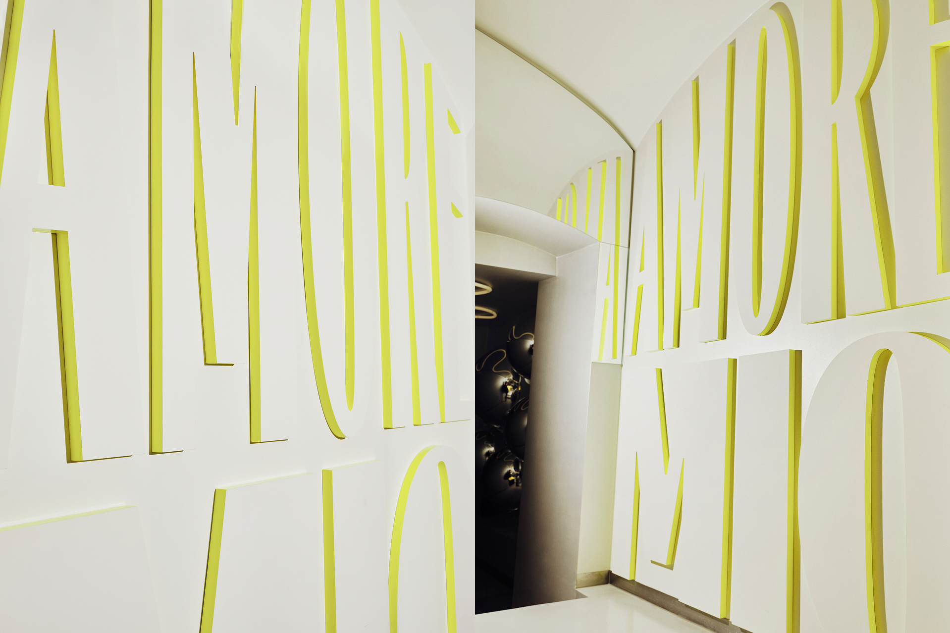
From holo foil stickers and apron straps to plexi sidewalk signs, oversized 3D wall lettering, interactive neon, logo, façade and door signage, overhead and paper menus. All speaking the same language, creating the world of Ciao.
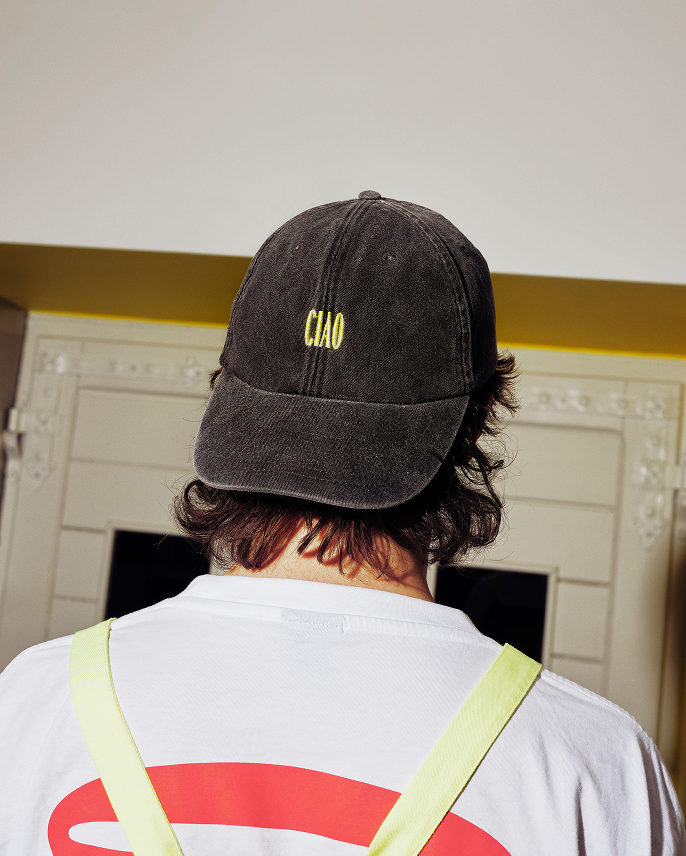
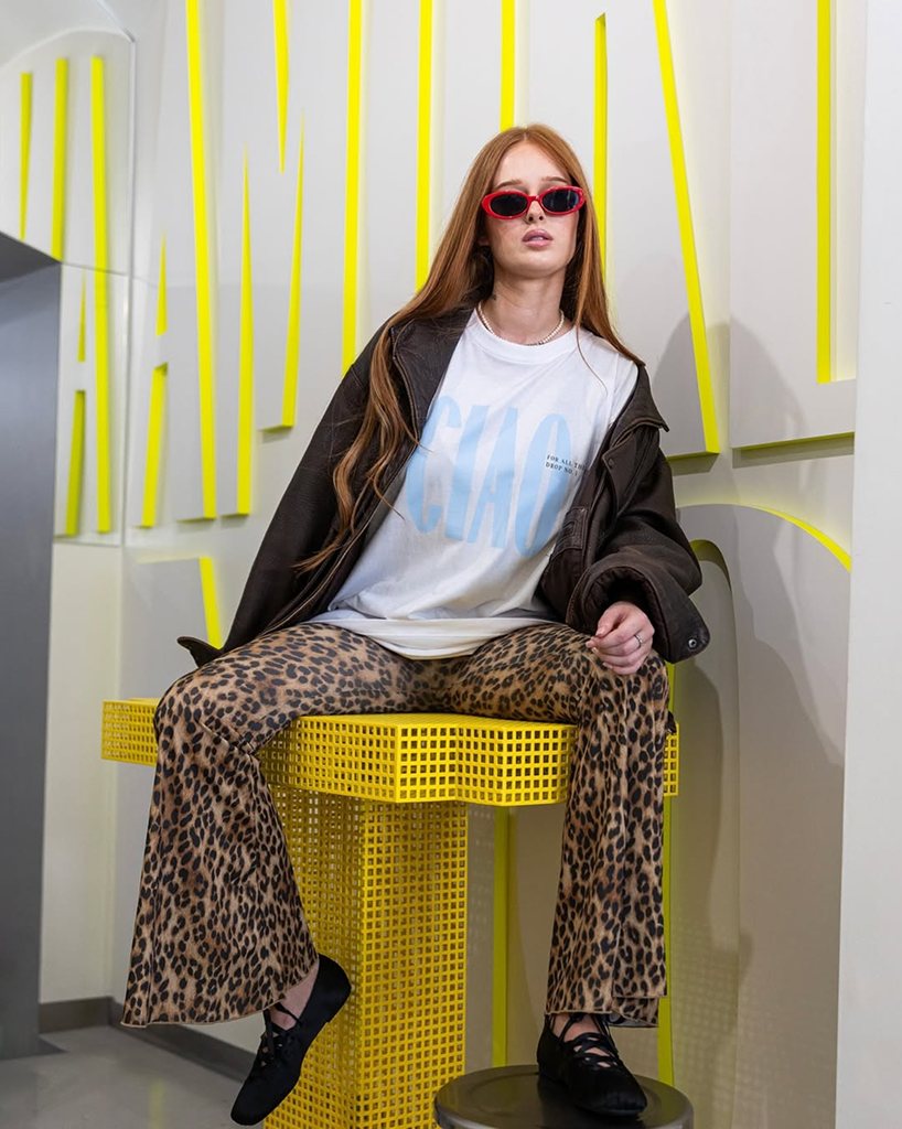
Beyond the staff aprons, we designed tees that became desired brand merch.



CREDITS
Owner and name: Izabela Szelągowska
Creative and art direction, head designer: Paulina Suchińska
Design crew: Dawid Prząda, Ewa Jakubowska
Hand animations: Katarzyna Klebert
Merch photos and videos: Ania Nemezja & crew
Interior and branding photos: Flamboys studio
Videos and photos: CIAO archives
Hand animations: Katarzyna Klebert
Merch photos and videos: Ania Nemezja & crew
Interior and branding photos: Flamboys studio
Videos and photos: CIAO archives
like it? get in touch!
hello@widok.studio
hello@widok.studio