LOLA
Funky, fresh, unapologetic pizza place
Who the hell is Lola? A pizzeria with a distinct character impossible to confuse with anyone else. A familiar classic, reimagined as someone new. A brand built not around a place, but around a person expressive and always evolving.


SCOPE OF WORK
Research
Visual Strategy
Visual Identity
-> Logo
-> Key Visual
Implementation
-> Menu
-> Uniforms
-> Merch
-> Packaging
-> Neon
-> Signage
Every woman has her moods. Lola is no exception.
Sometimes soft and rounded, sometimes sharp and pointed. Effortless, expressive, slightly imperfect and never entirely still. Her changing moods became the foundation of the identity.

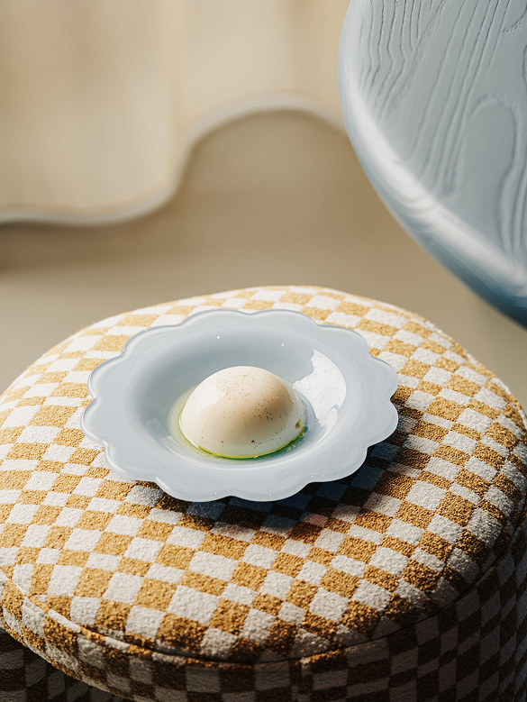
We began with one of the most familiar visual codes of the classic pizzeria – the checkered tablecloth.
Then we let it move. The pattern stretches, shifts, sharpens and softens – changing with the format, season and mood while remaining unmistakably Lola.
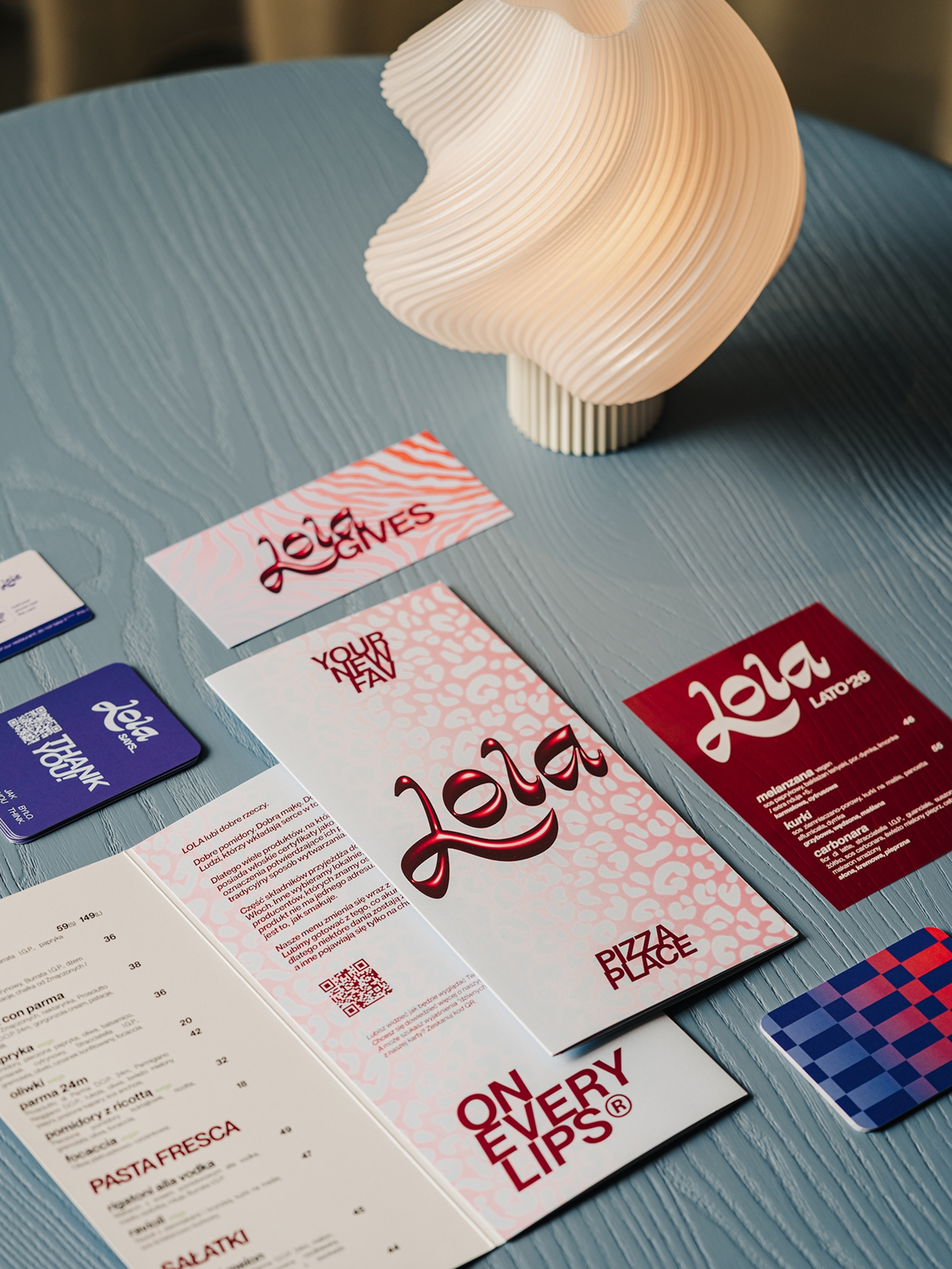
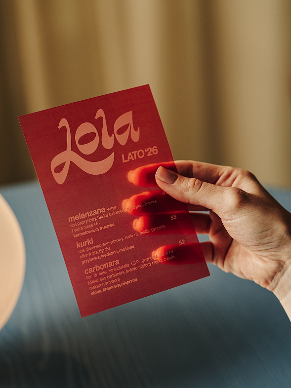
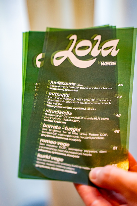
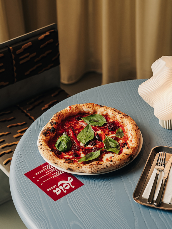
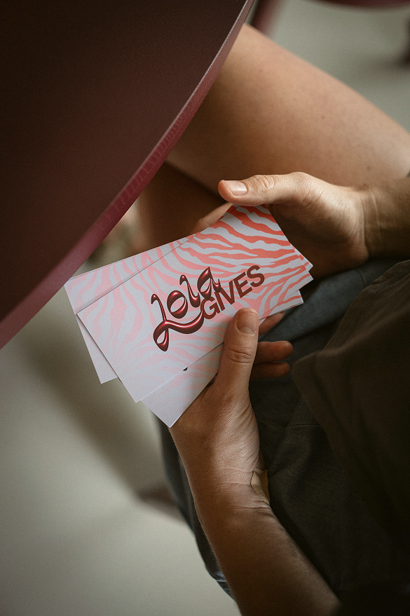
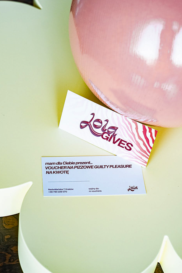
menus & voucher
Sometimes checkered, sometimes leopard, zebra or something softer. Lola changes her look with the season – and her menus and vouchers change with her.
One language, many expressions
The pattern isn’t simply applied to the brand. It moves through it – from the interior and shelving to menus, coffee packaging, merchandise and the smallest details.
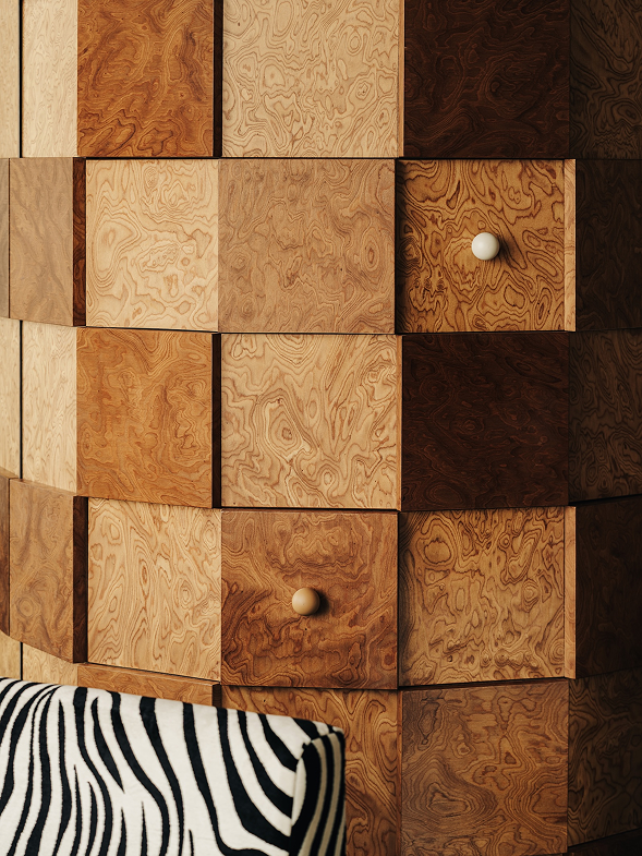
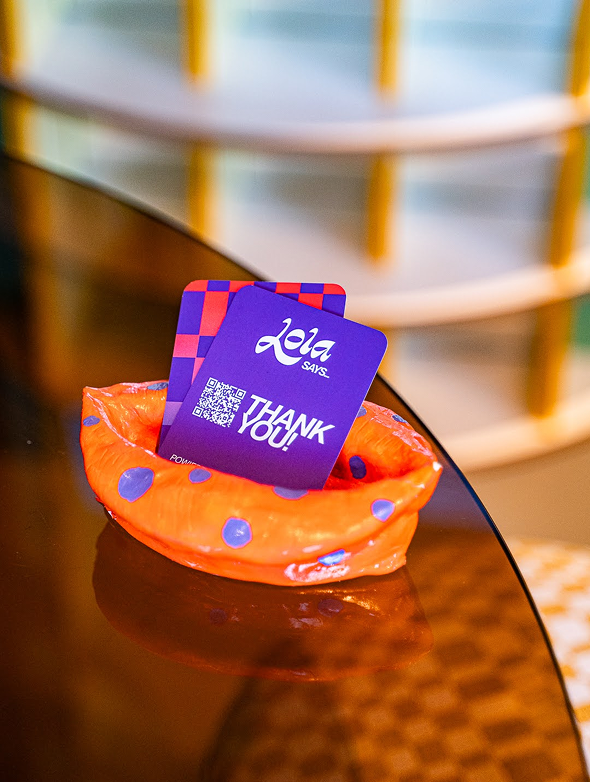
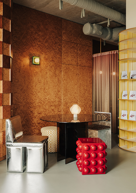
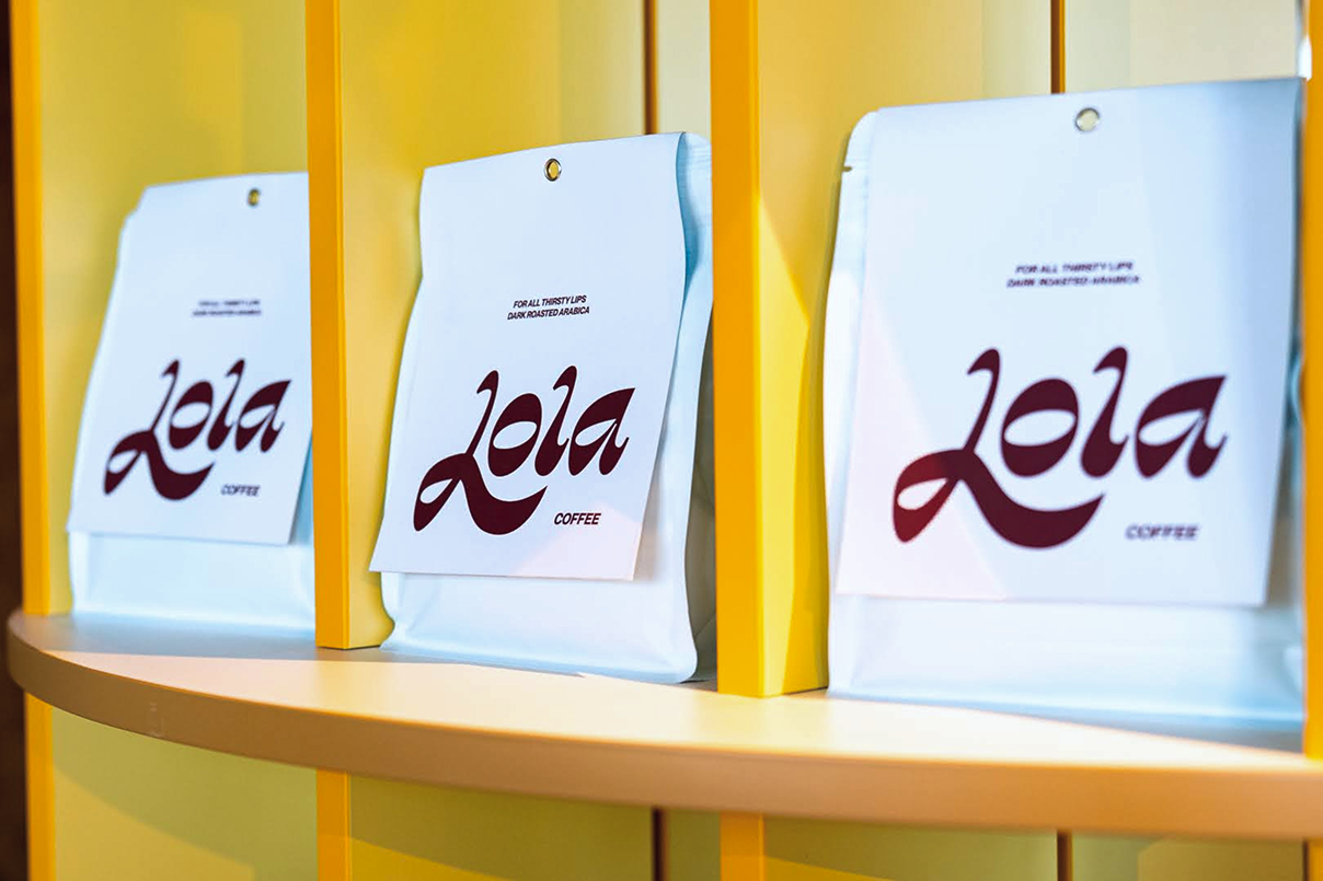
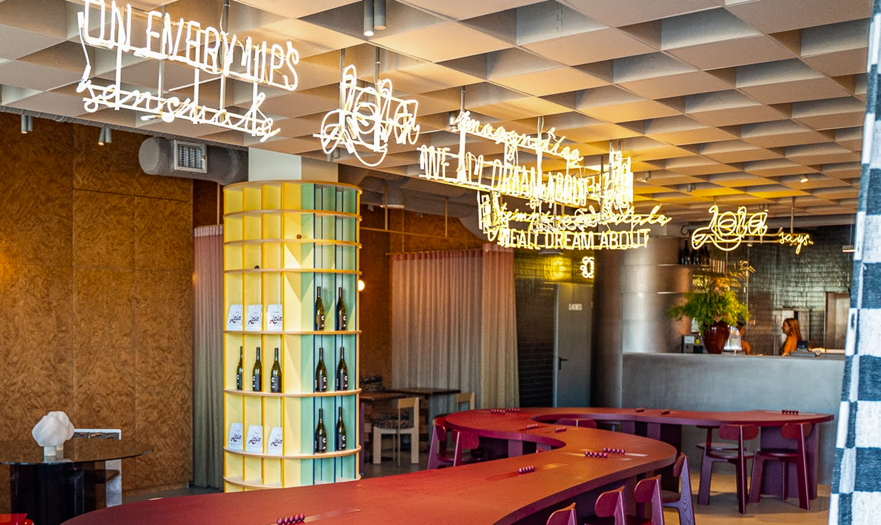
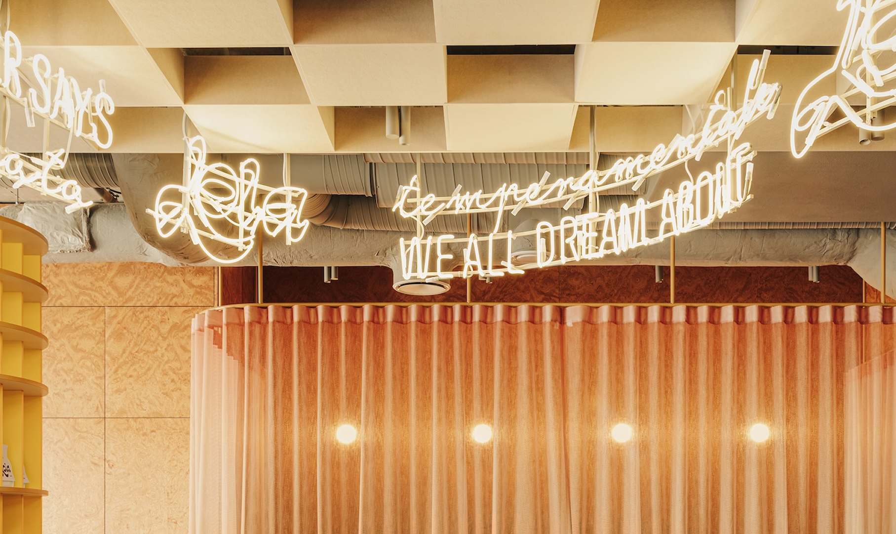
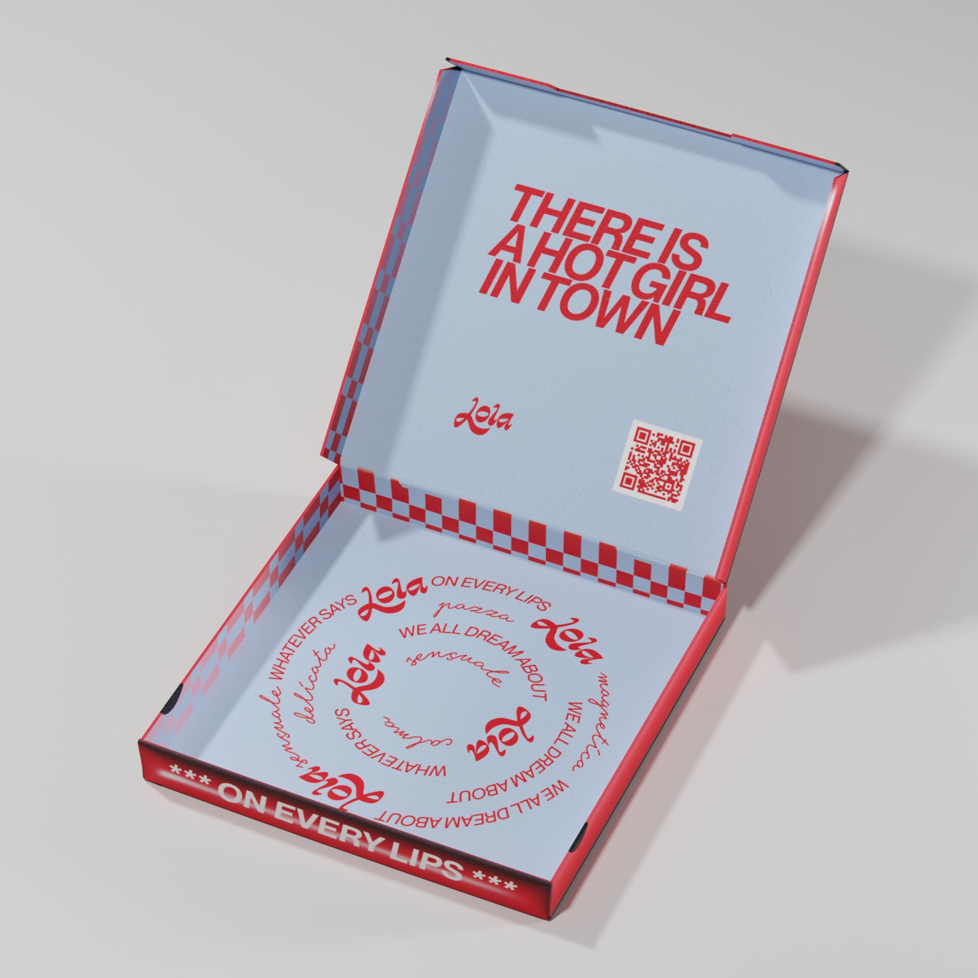
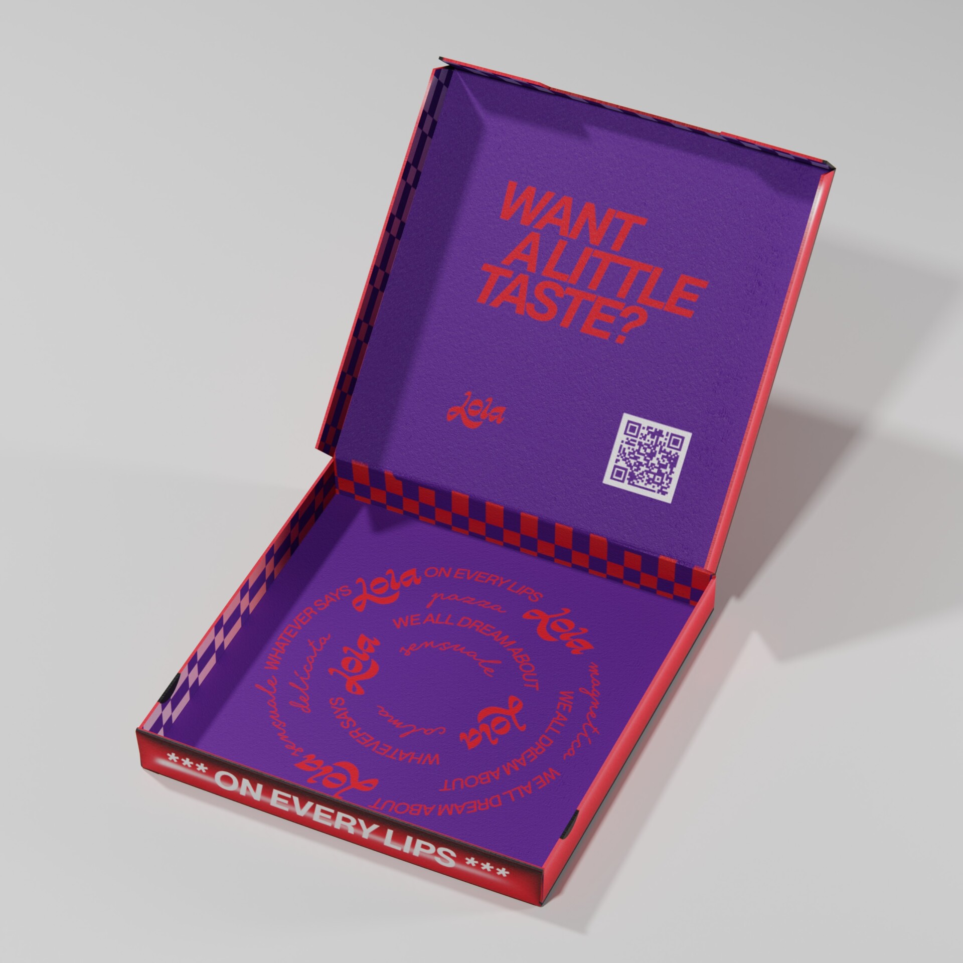
Lola talks back. Her voice moves through the entire brand – from merchandise and packaging to social media and the neon above the bar. Lola Coffee is “for all thirsty lips.”and the vouchers simply shout: “lola gives”.

uniforms & merch
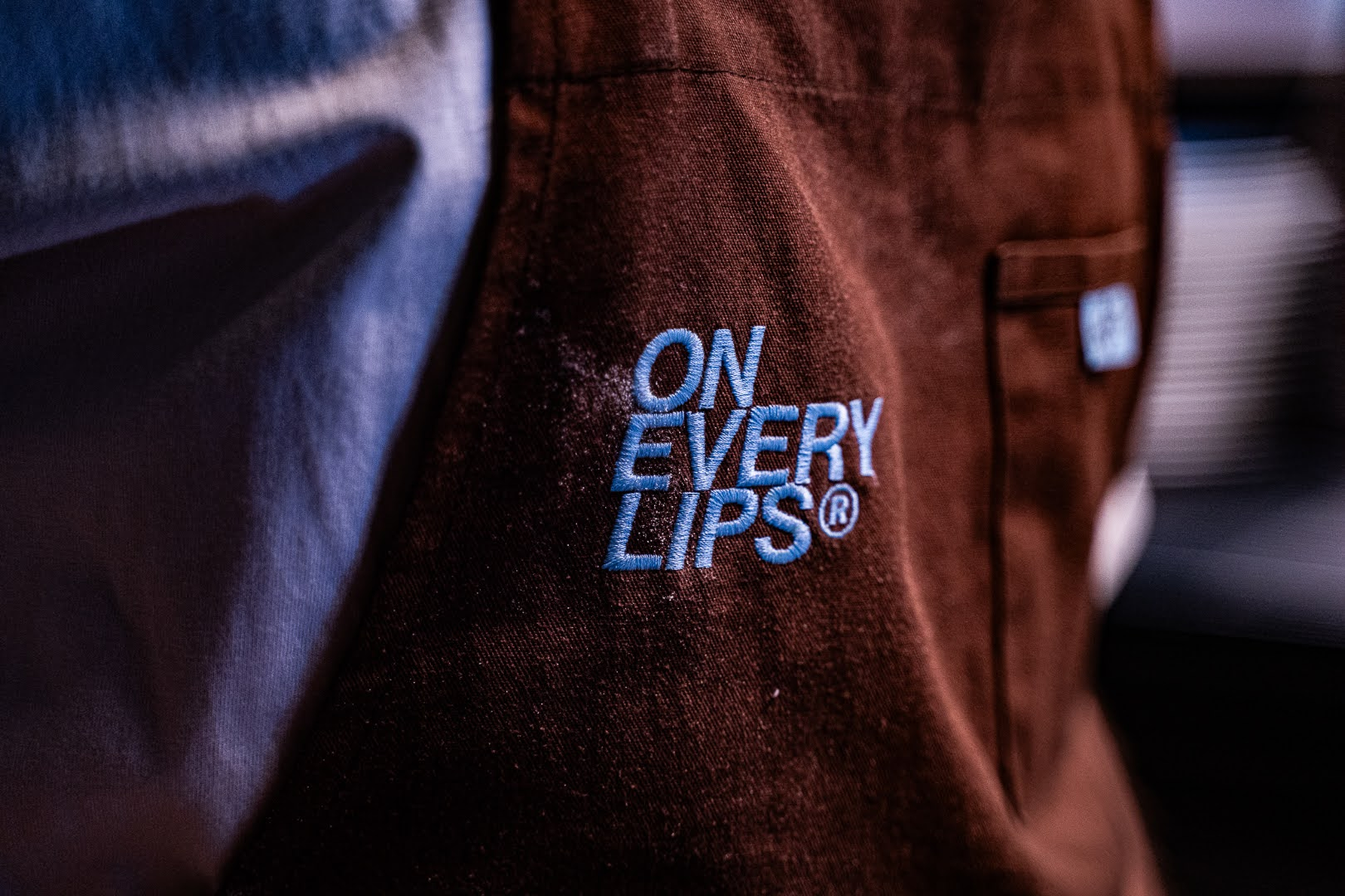
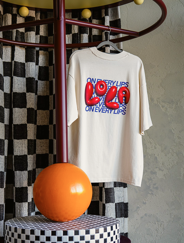
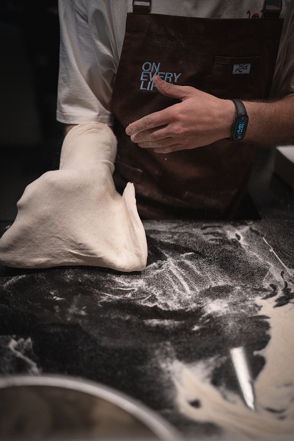
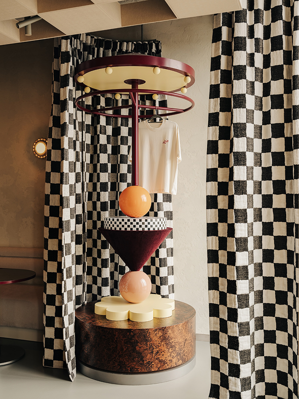
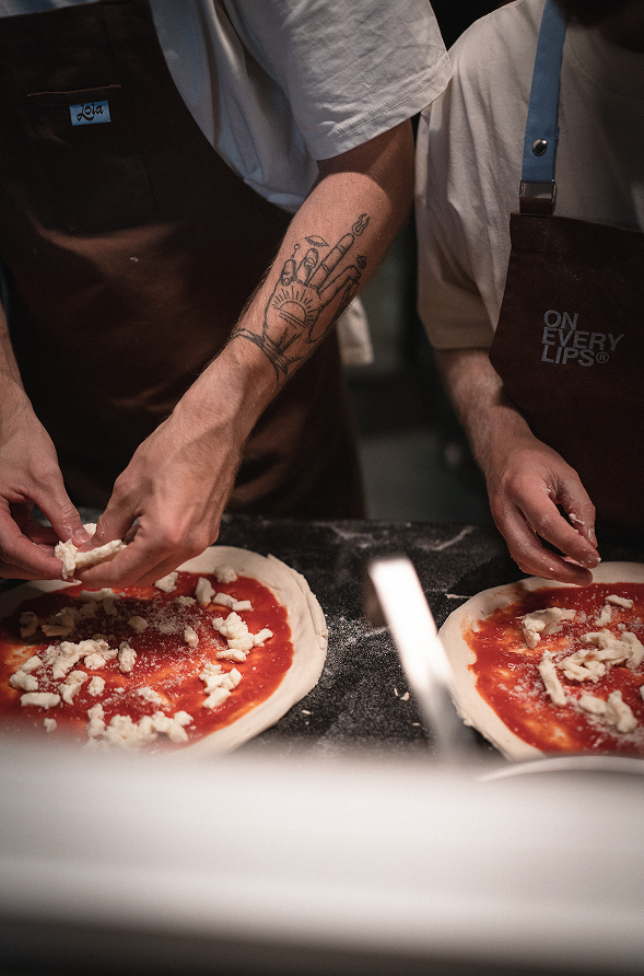
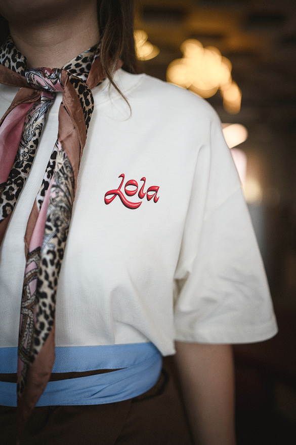
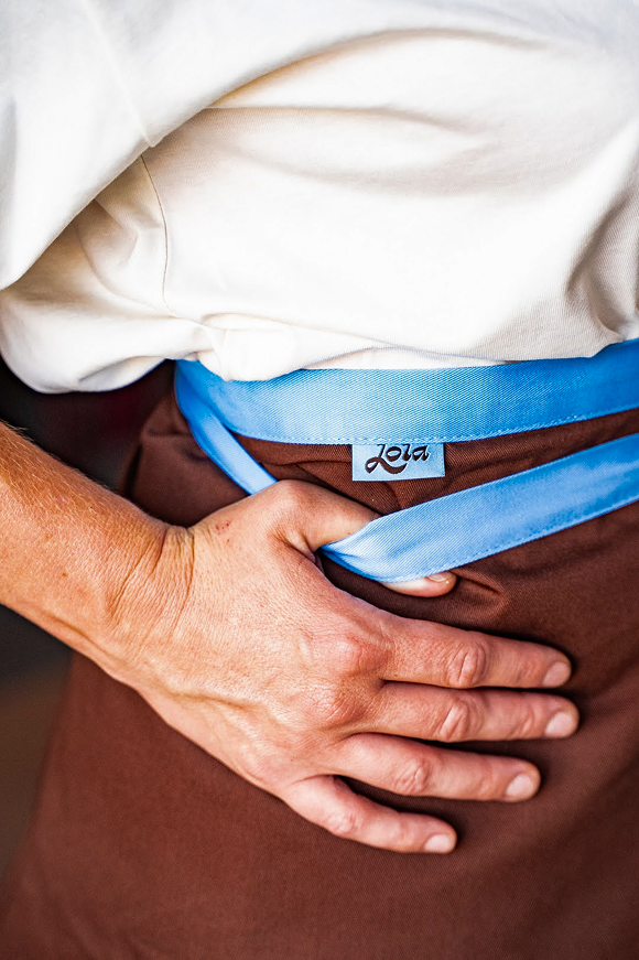
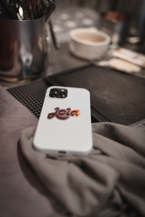
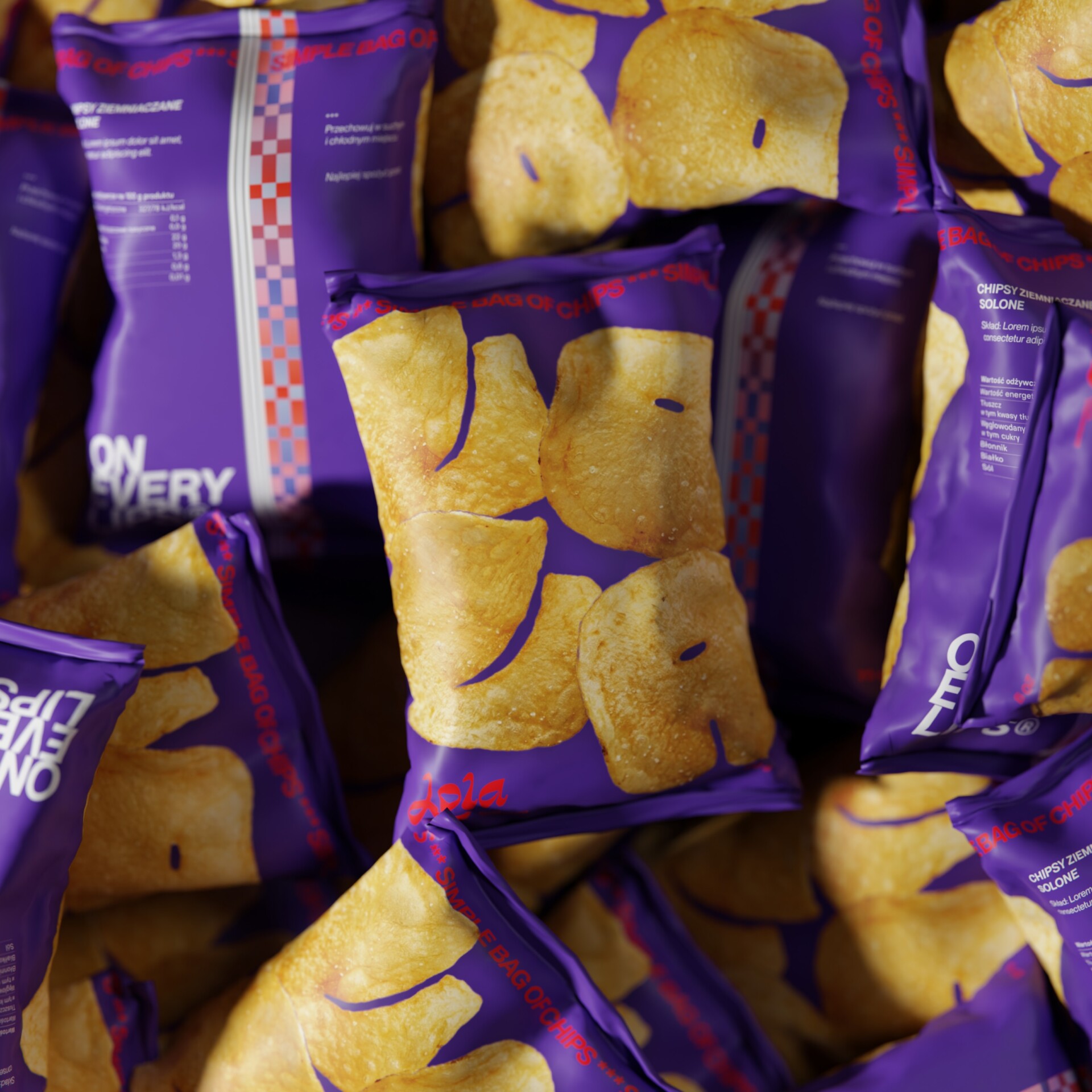
Stickers, keychains and the chips waiting at the table carry the same character.
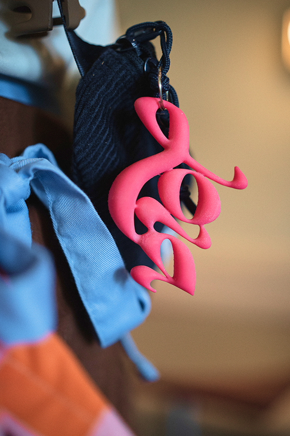
Neon & signage
packaging
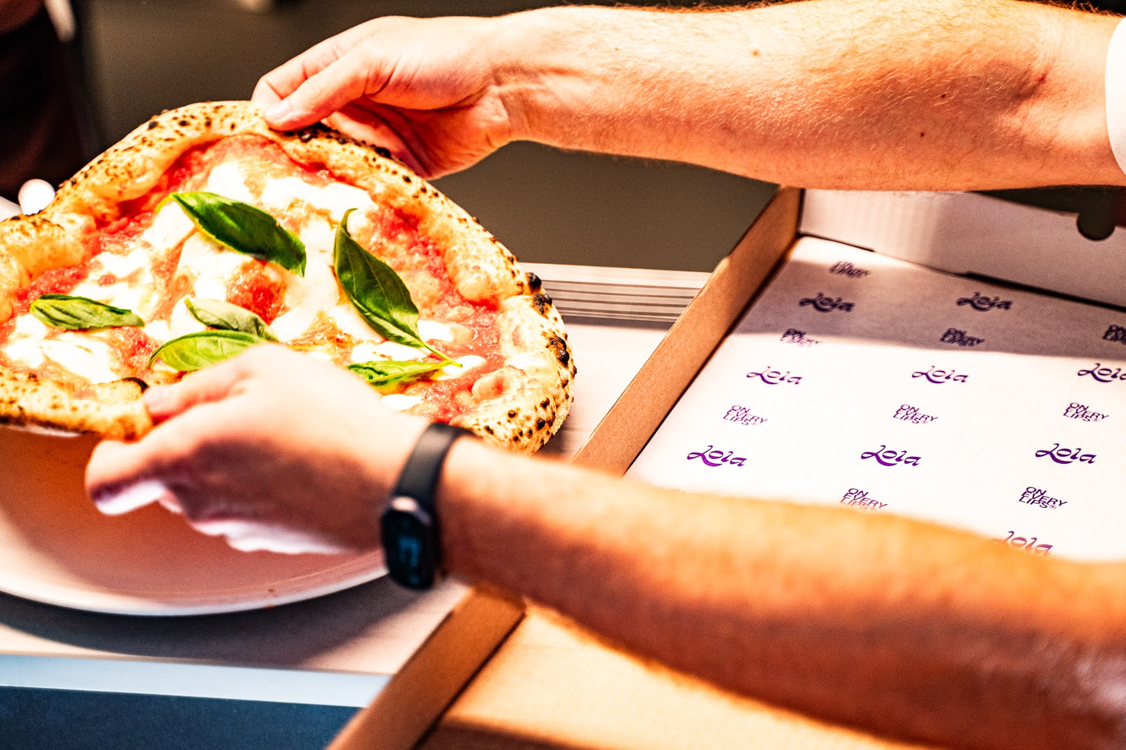
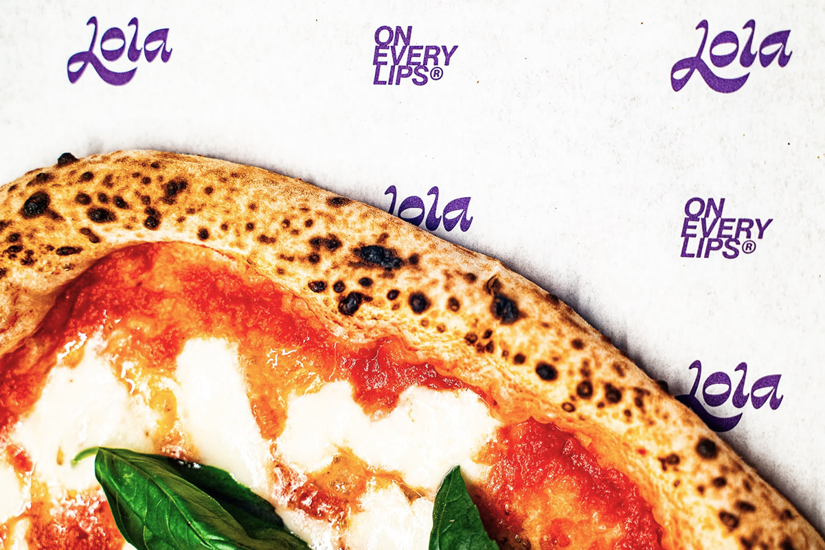
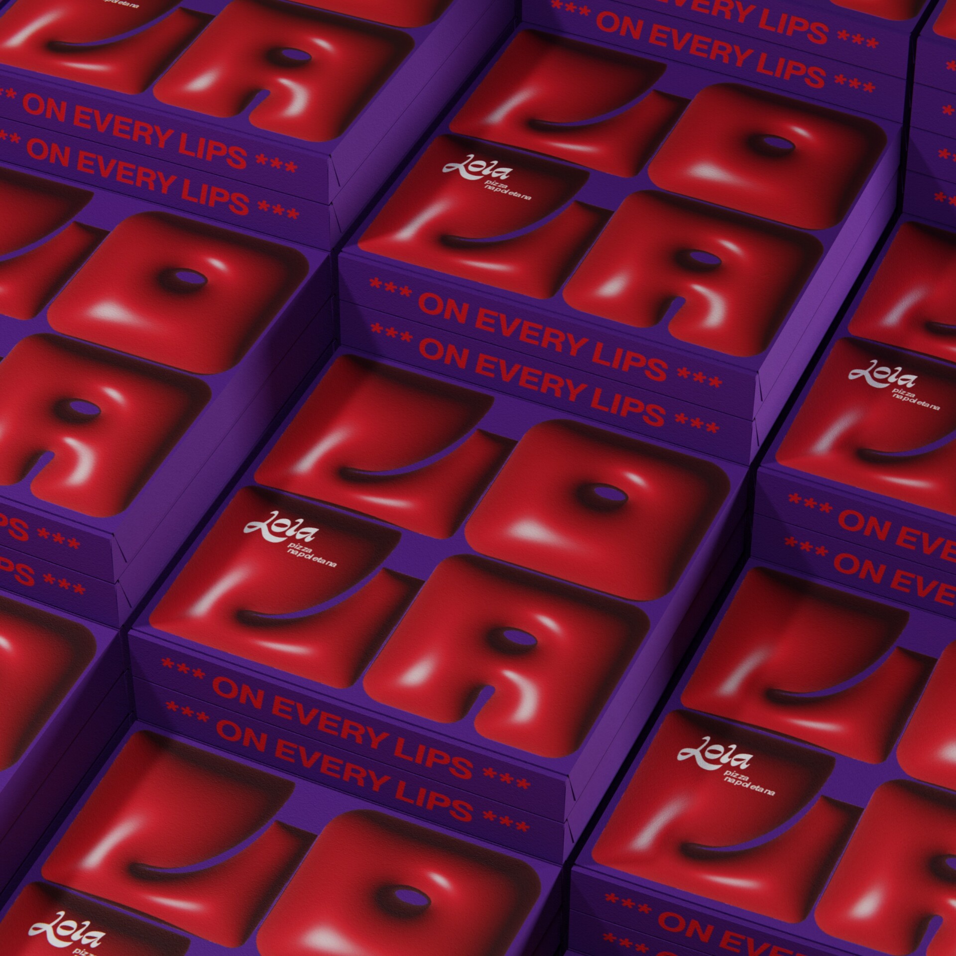
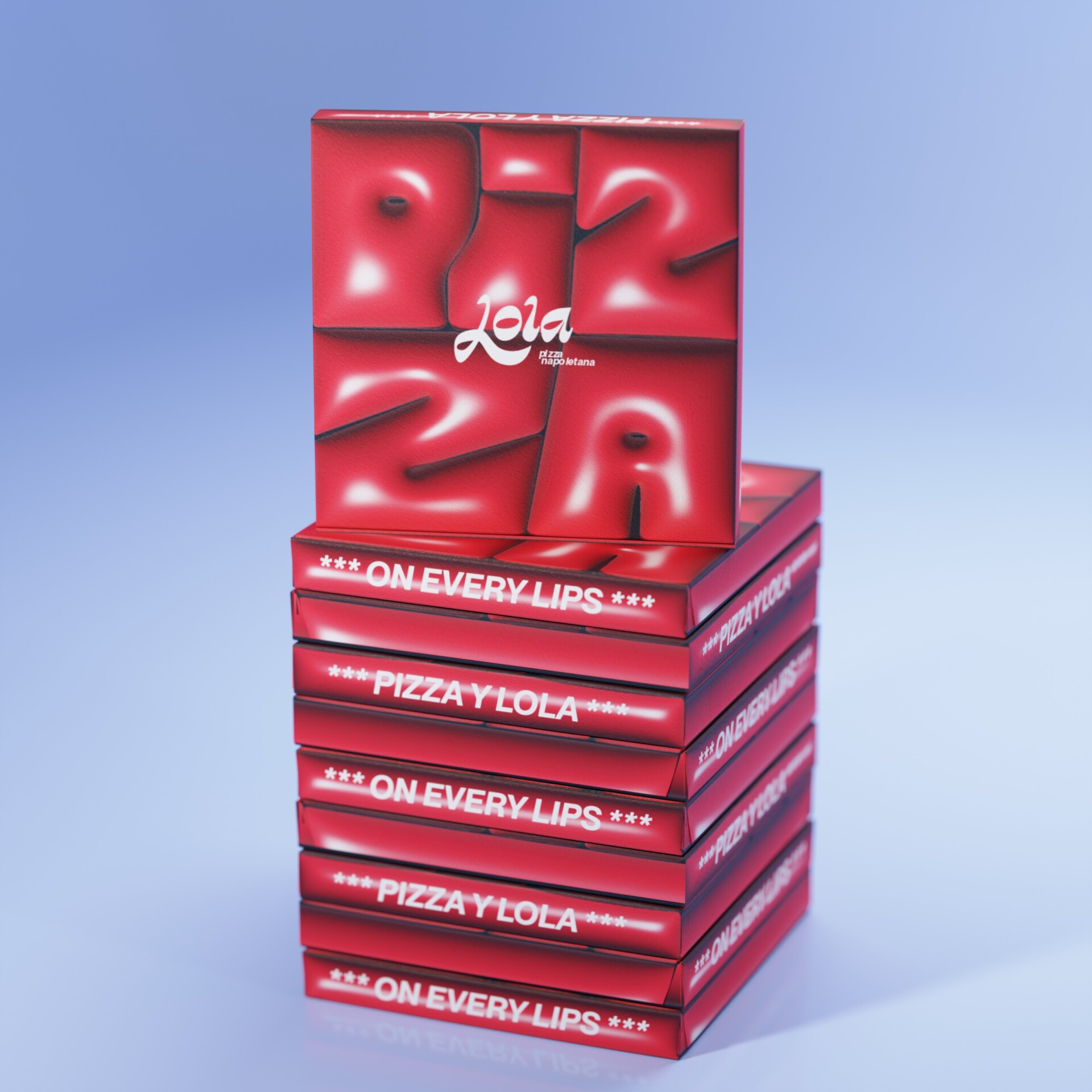
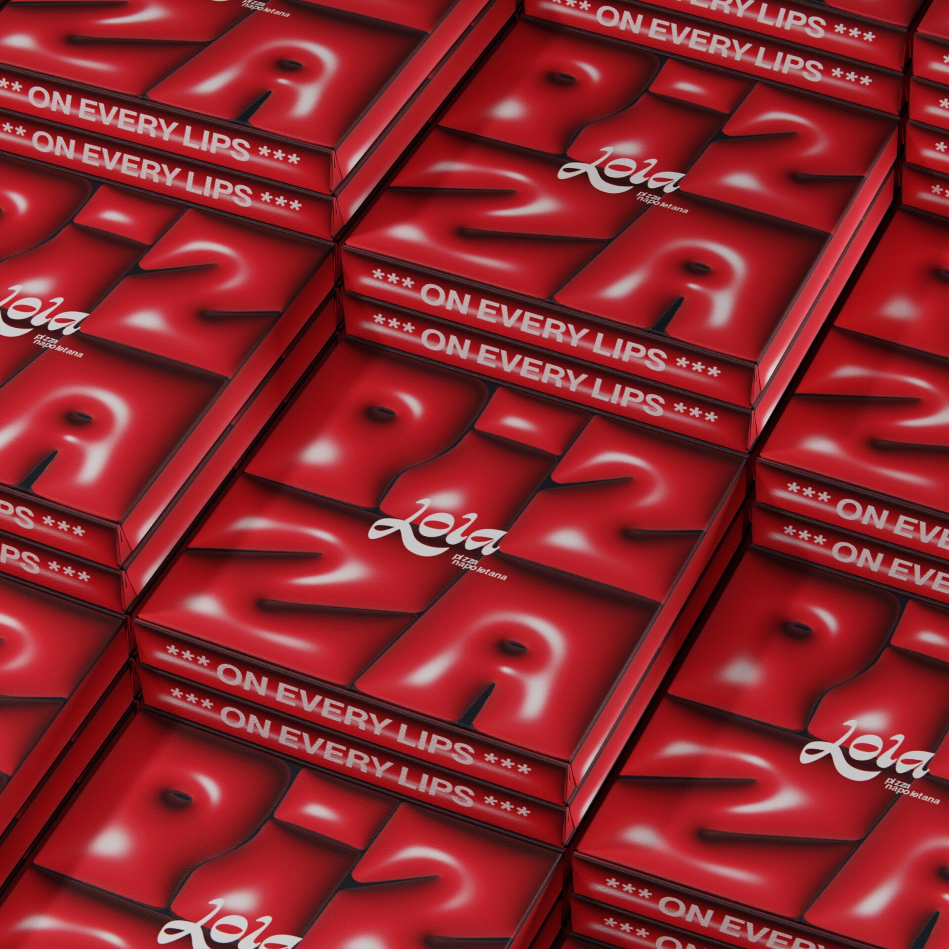
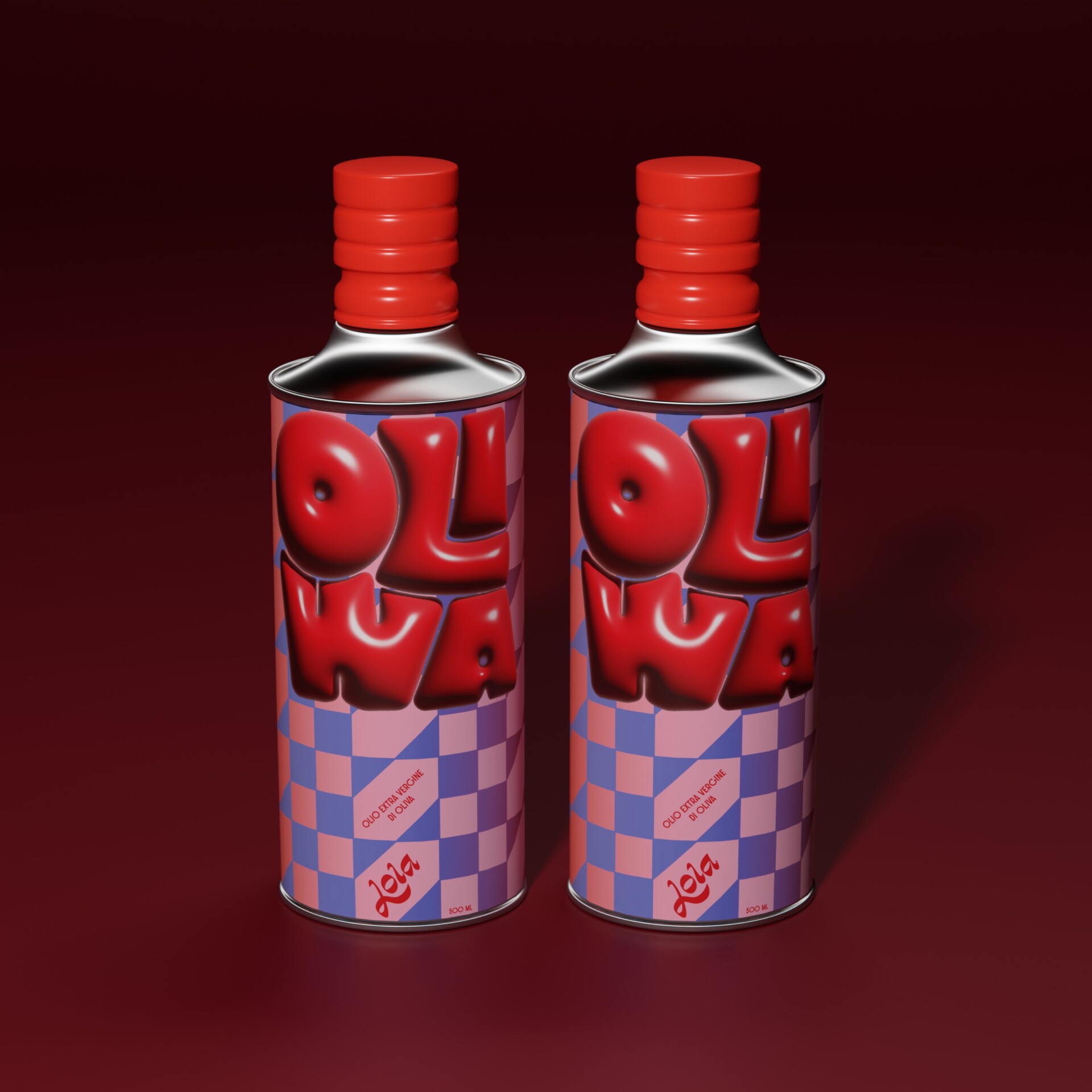
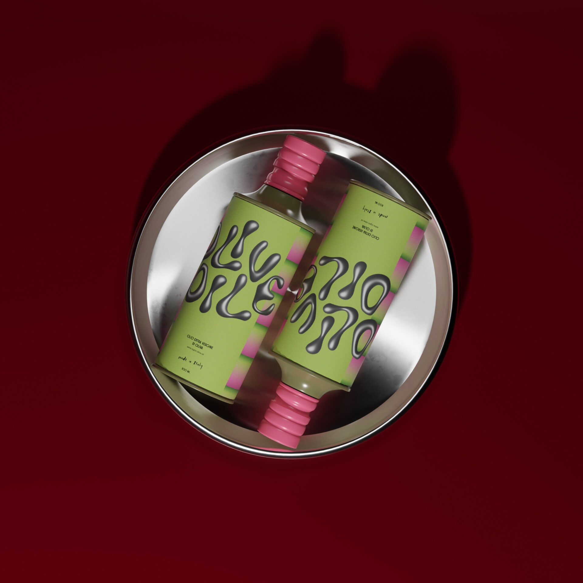
Lola takes on different forms: full and voluptuous, stretched thin, soft, sharp or slightly unruly. Across pizza boxes, bottles and bags, her shapes are allowed to move, change and feel alive.
Signage
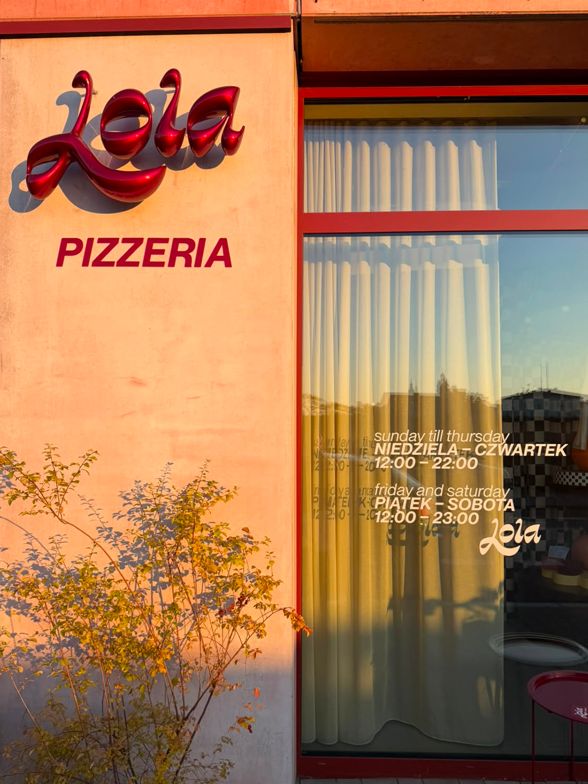
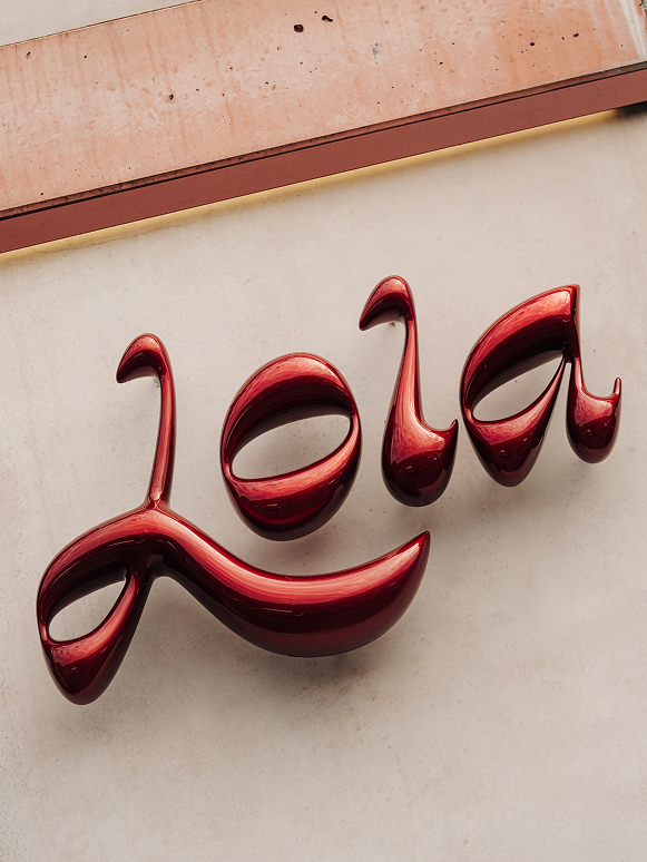
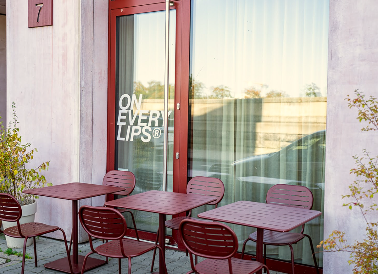
Subtle in the morning. Golden as the light passes through the signage and casts its shadows across the floor. After dark, the neon takes over – filling the interior with Lola at full volume.
Renders: Bartłomiej Suski