CREDITS:
PAESE
repositioning of Polish cosmetic giant
Paese had been on the market for over a decade. People knew the name, but not for high-quality products. We repositioned Paese from a makeup brand to one that puts skin first.

Scope of work:
MARKET RESEARCH & ANALYSIS
BRAND REPOSITIONING
BRANDING
-> Logo redesign
-> Key Visual
-> Color Palette
-> Icons & Illustrations
PACKAGING
-> Developing packaging lines
-> Developing limited editions
-> Designing Gift packs & sets
POINT OF SALES
-> retail and displays art direction
-> pr boxes design
COMMUNICATION
-> social media graphics
-> posters & flyers
WEBSITE DESIGN
-> e-commerce layout
-> product landing pages
ONGOING BRAND SUPPORT since 2020
The name “Paese”, which means “land” in Italian, served as an inspiration for a fundamental shift in the brand’s image.
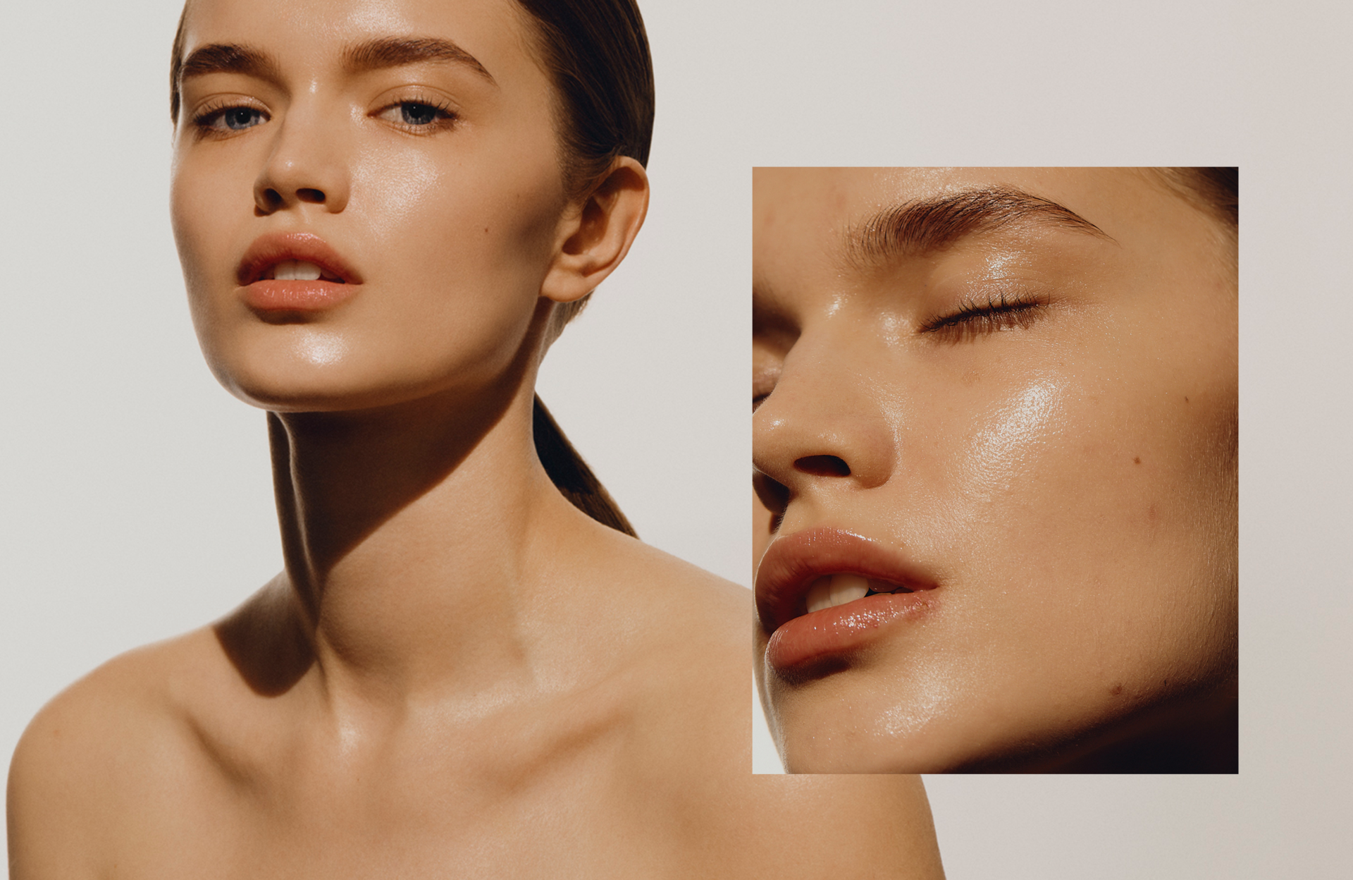
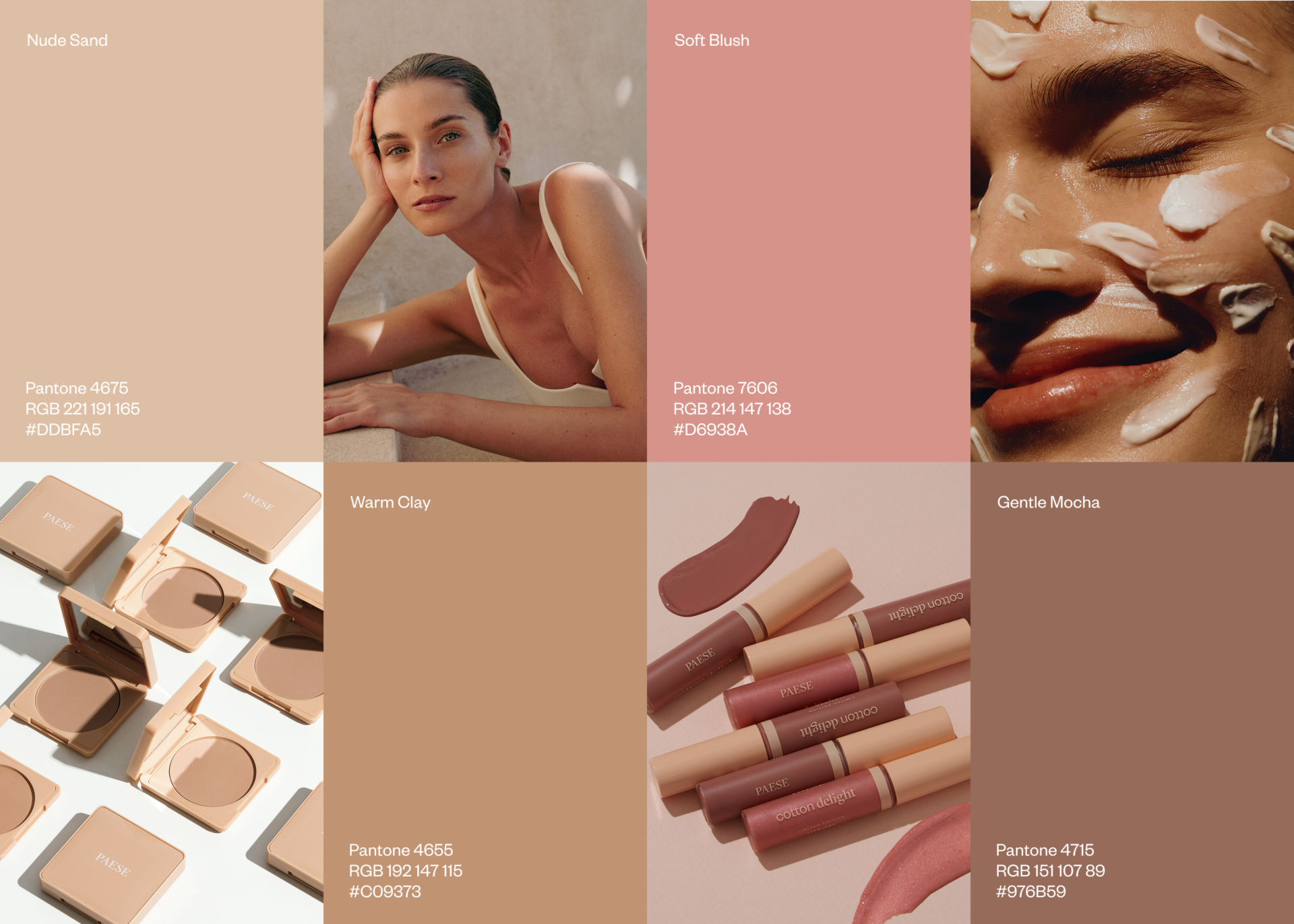
Land for us is a metaphor for the body — a reminder that the better we care for what’s beneath the surface, the more it gives back in healthy, radiant skin. It also became a reflection of how Paese creates its products: with a focus on what’s inside. Rich active ingredients, short formulas and a considered use of natural ingredients. This naturally shaped the visual language — a palette drawn from the earth and the body: warm, earthy, skin-like tones and flushed cheeks. That is where we started.
(01)
PACKAGING
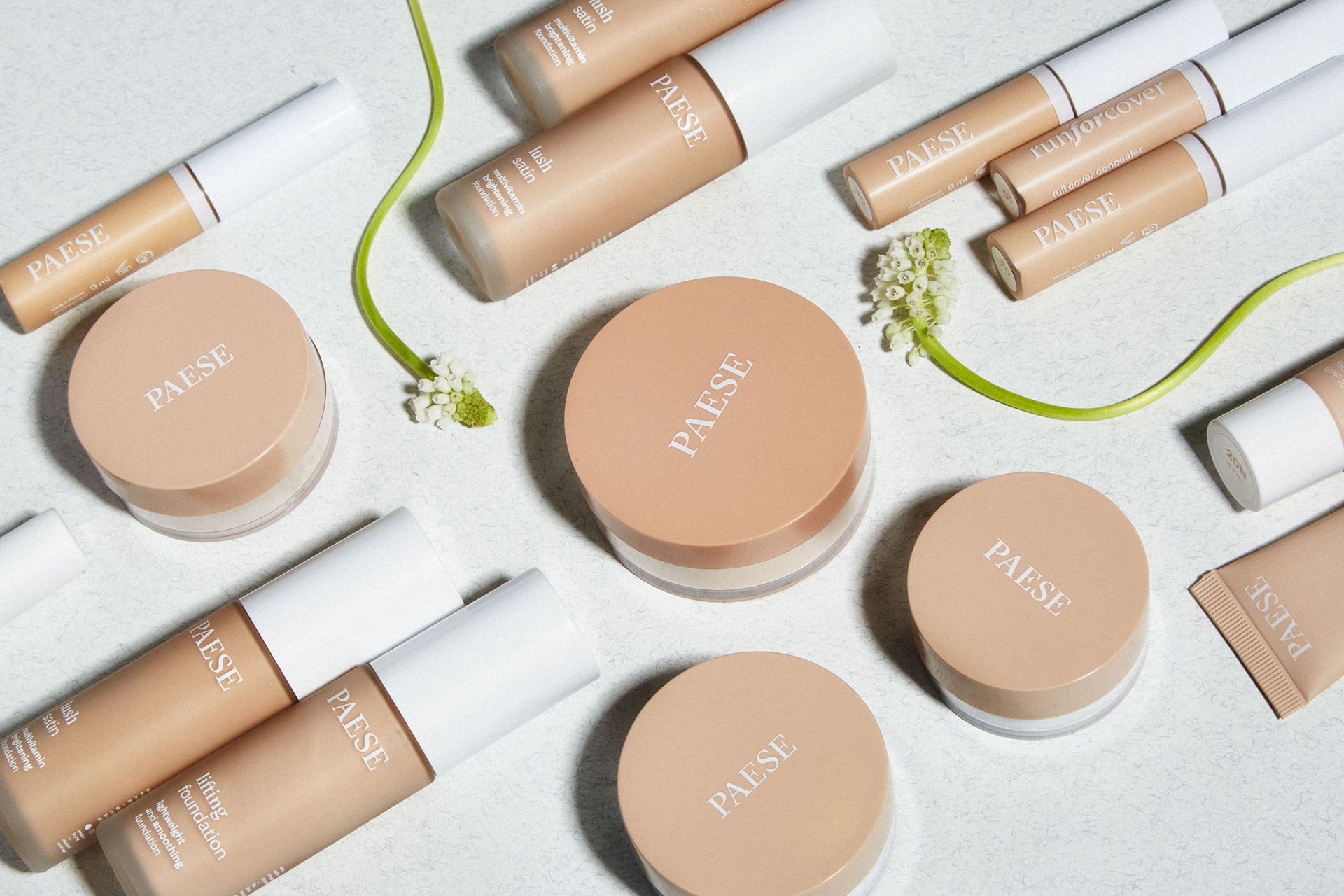
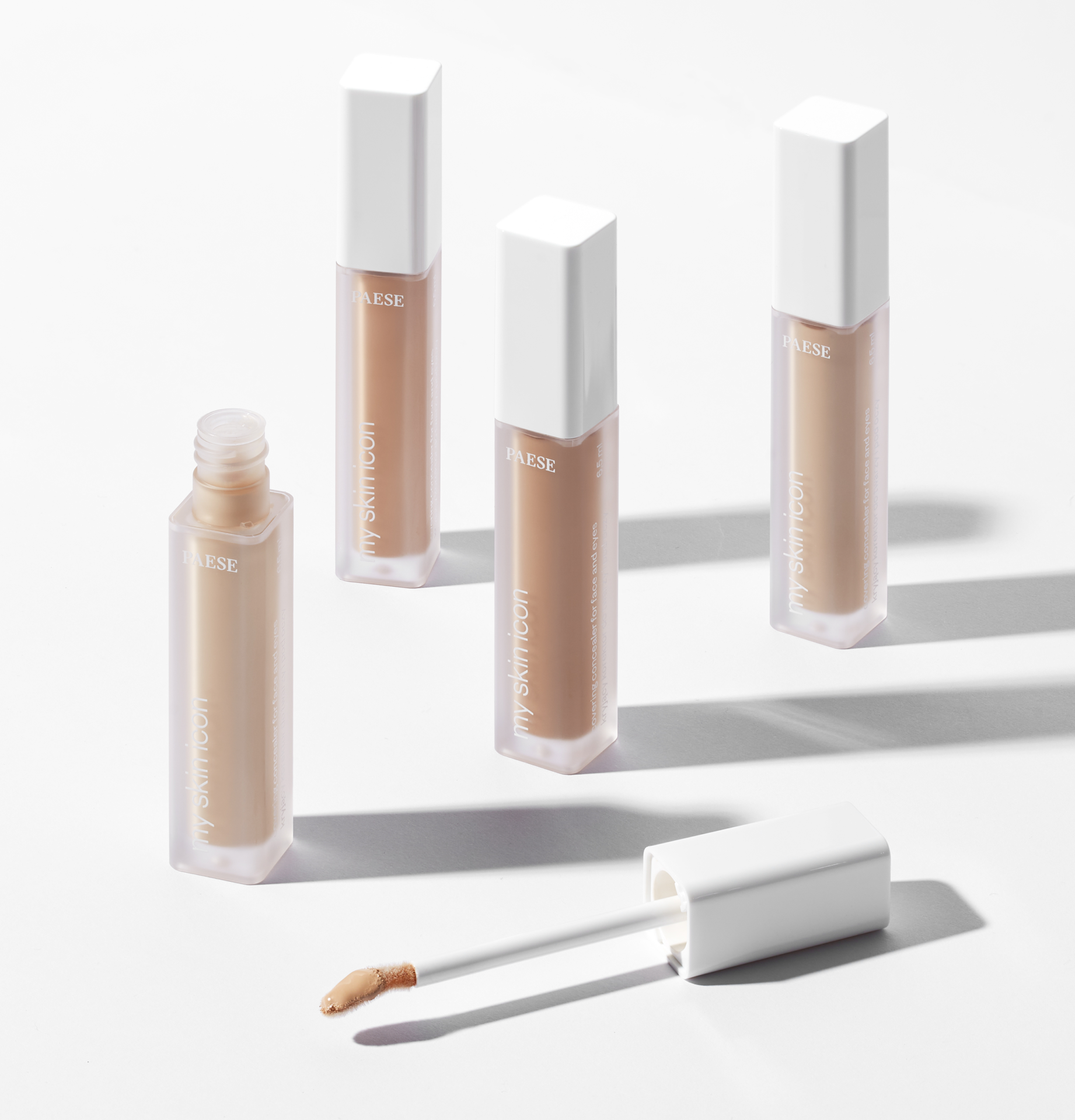
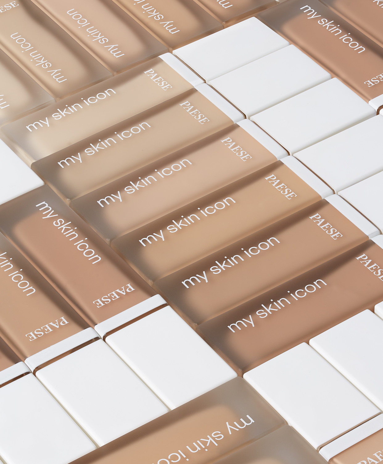
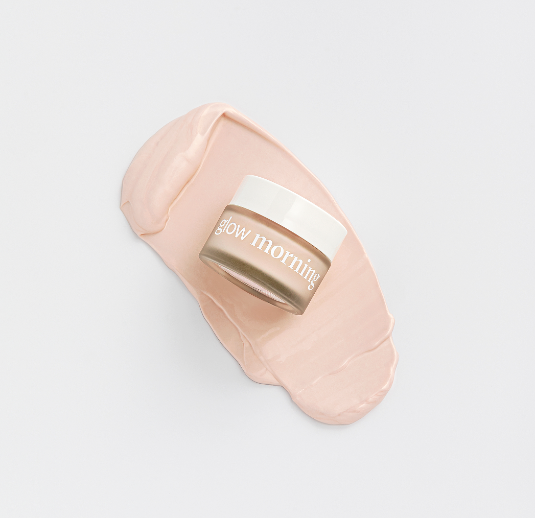
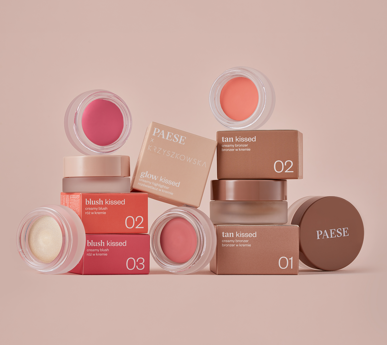
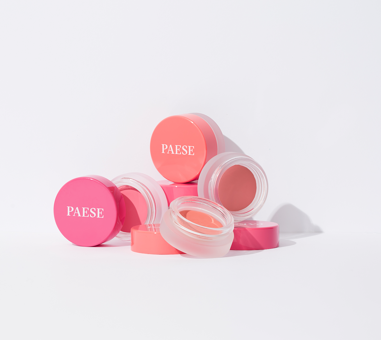
The challenge was to create a simple, consistent packaging system that could move effortlessly across different products — maintaining a strong brand presence while leaving room for flexibility. We built it around distinctive typography, clean grids and simple yet elevated materials. Plastic was replaced with frosted glass, black gave way to white, and subtle touches of gold were reserved for selected products — like little earrings, adding a touch of character to the whole line.


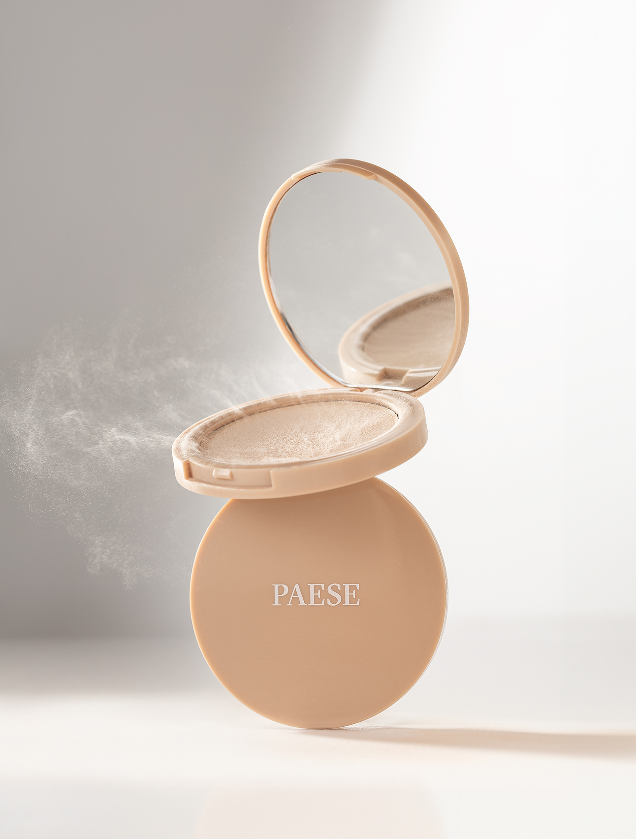


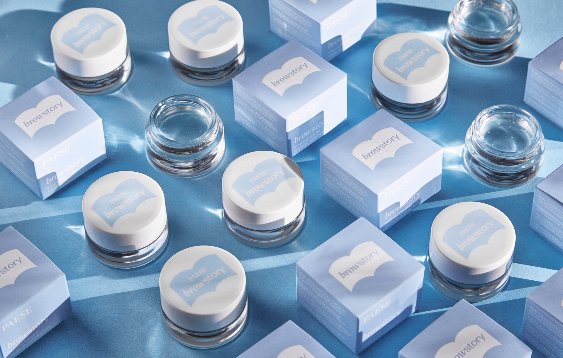
Alongside Paese’s basic cosmetic line, we worked on variety of new products and initiatives. These span regular retail items, limited editions, special releases, and collaborative projects with other brands.
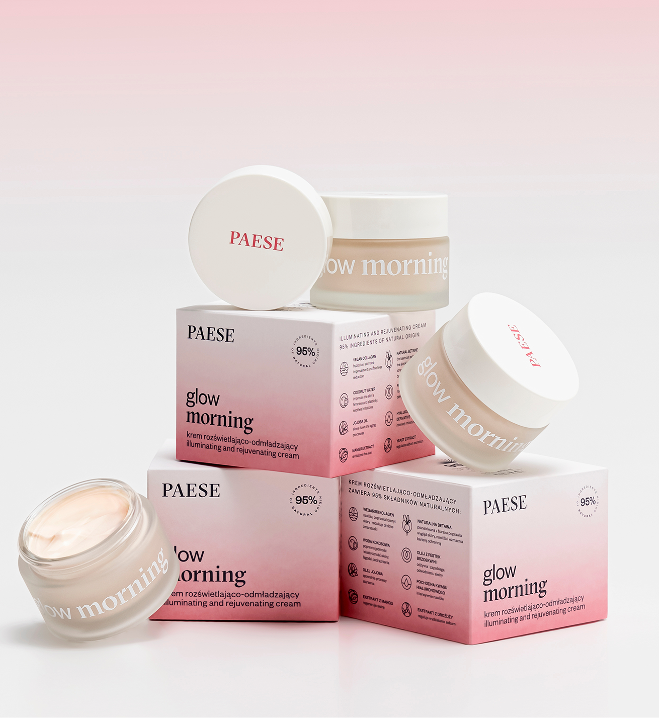
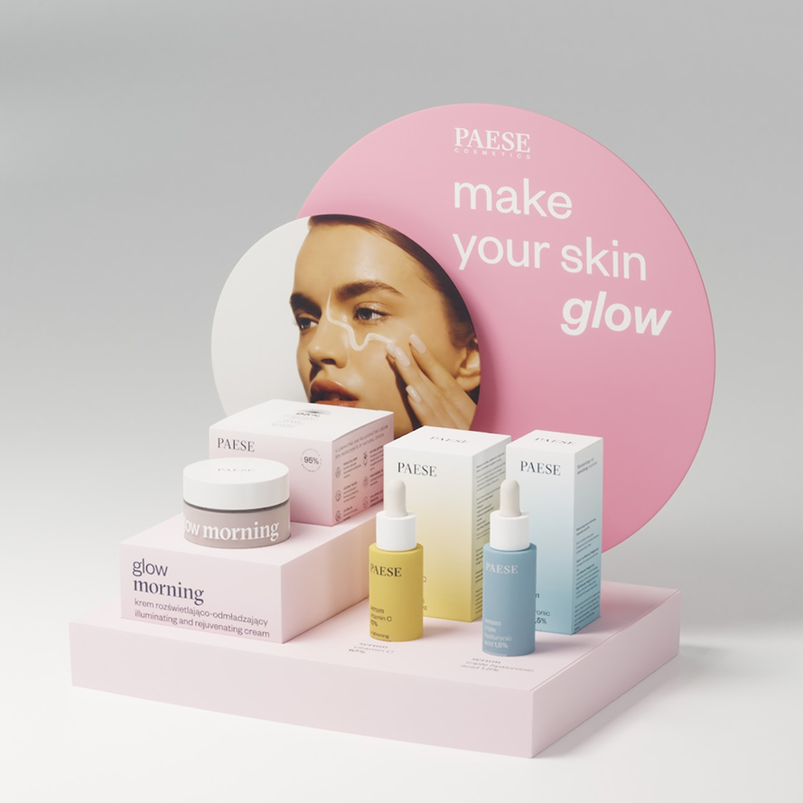
We created skin care line with a characteristic white-colored gradients.
Blushes and bronzers with range of cheeky colors.
Dark and chocolaty eye & brown products.
skincare


blushes
eye products

collaboratins

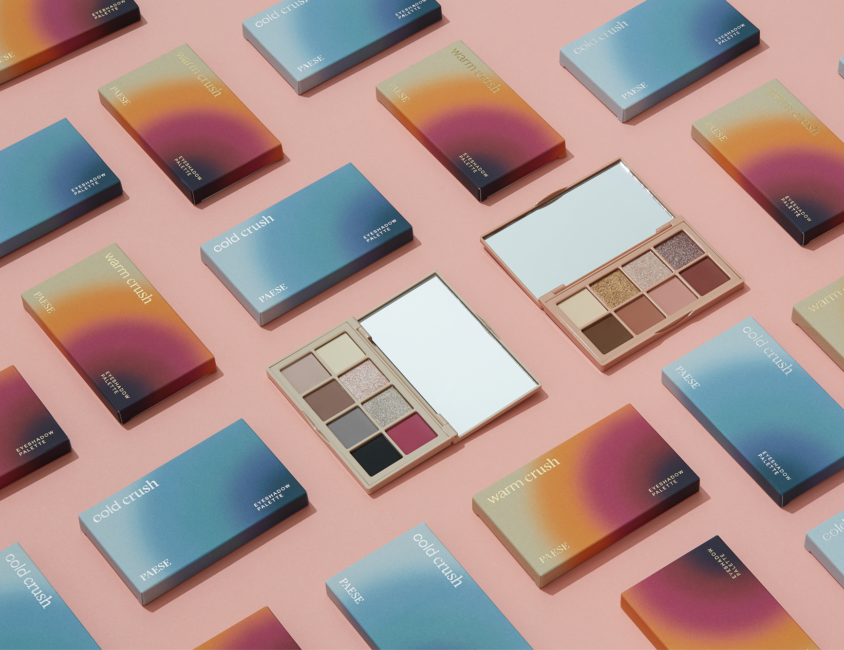

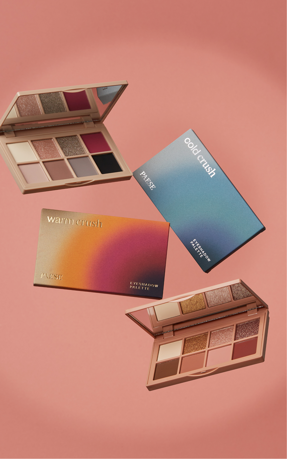
limited editions
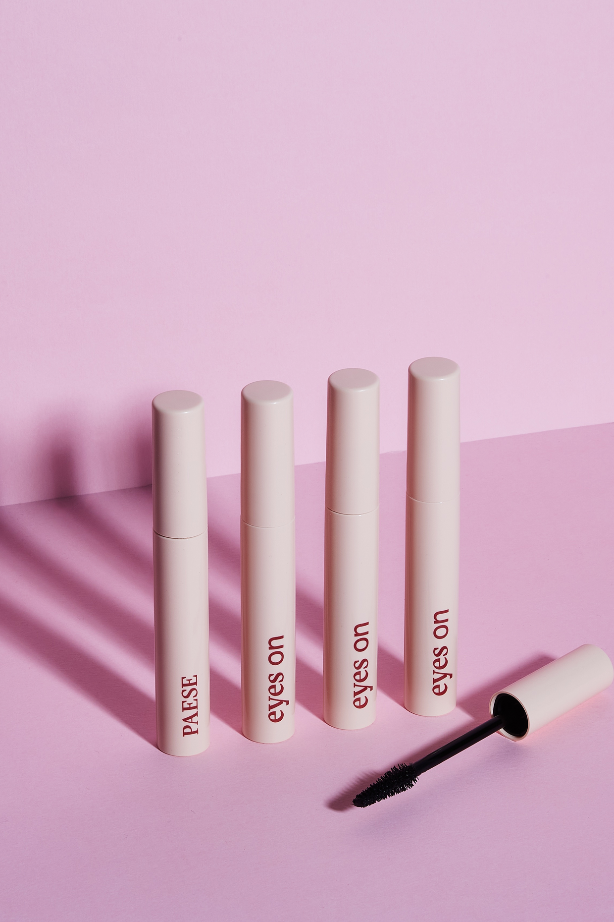
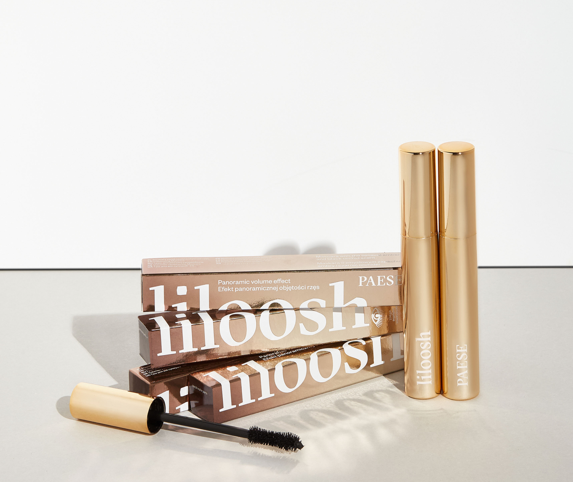
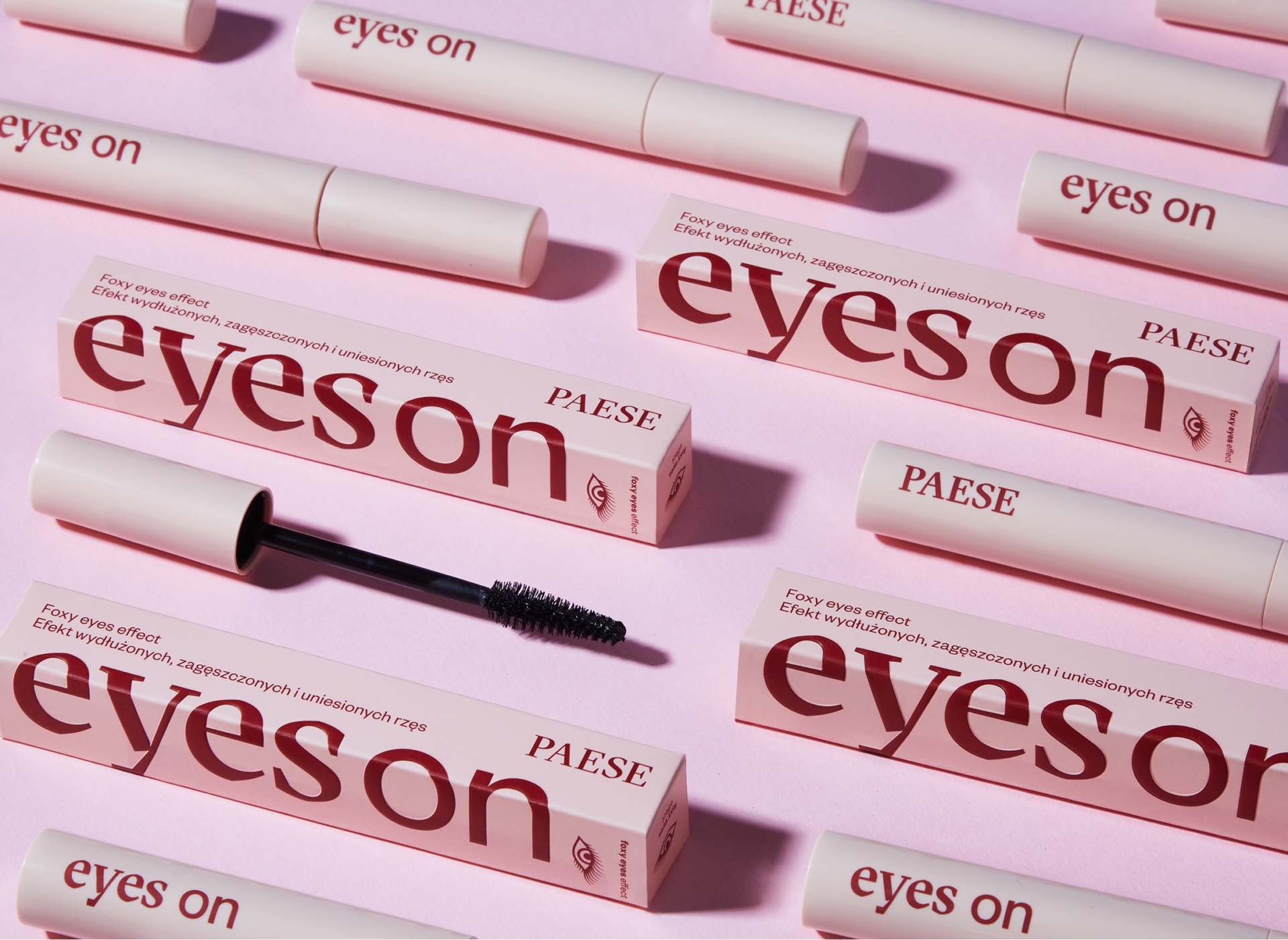
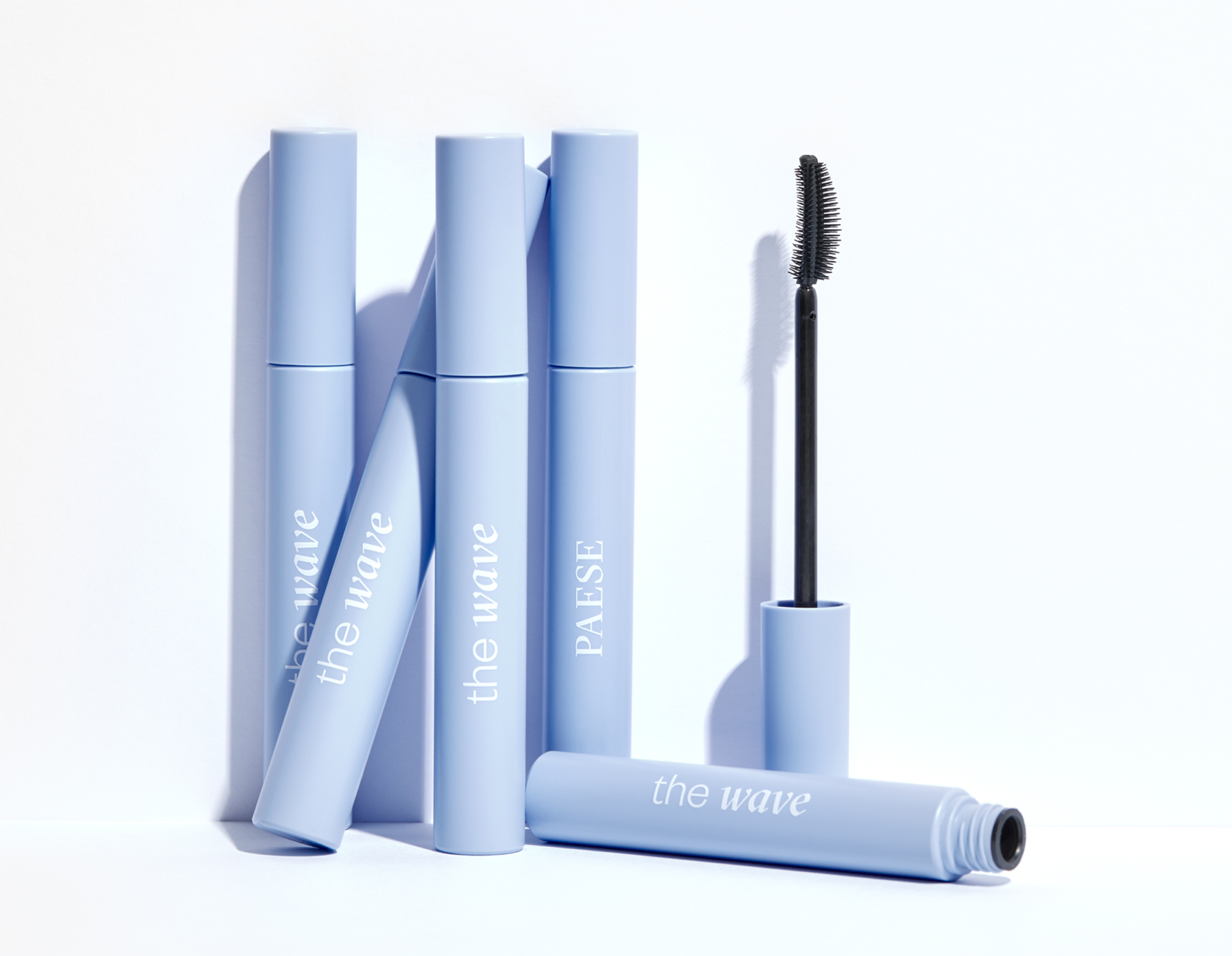
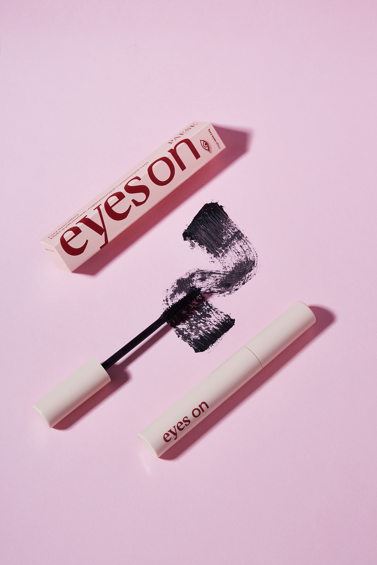
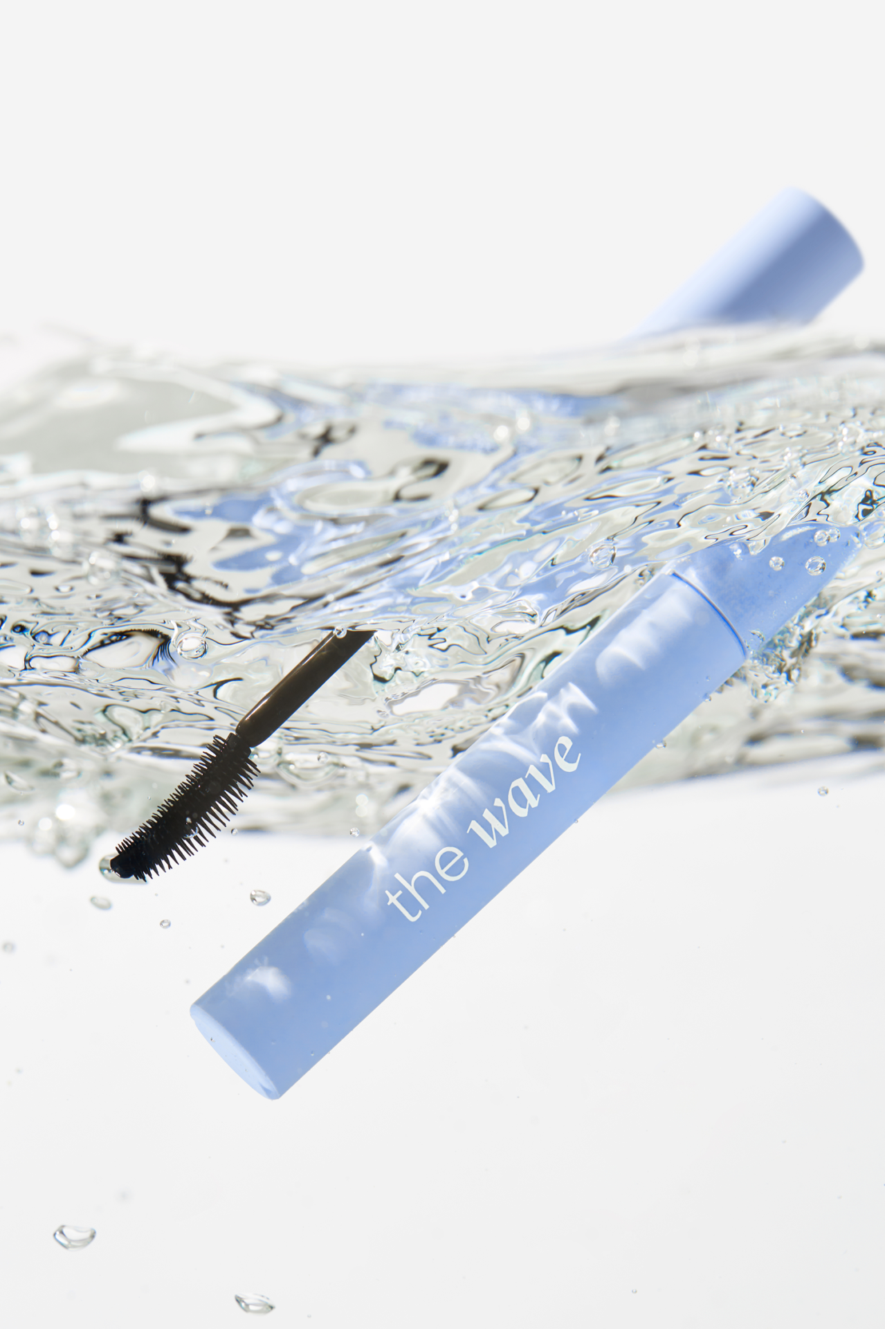
The mascara range needed a boost, so we created a bold, highly visible design and made each product easy to recognise and differentiate.

We brought the brand to life across retail, designing small POS materials alongside the concept and art direction for larger displays.
pos materials

gift packs and pr boxes

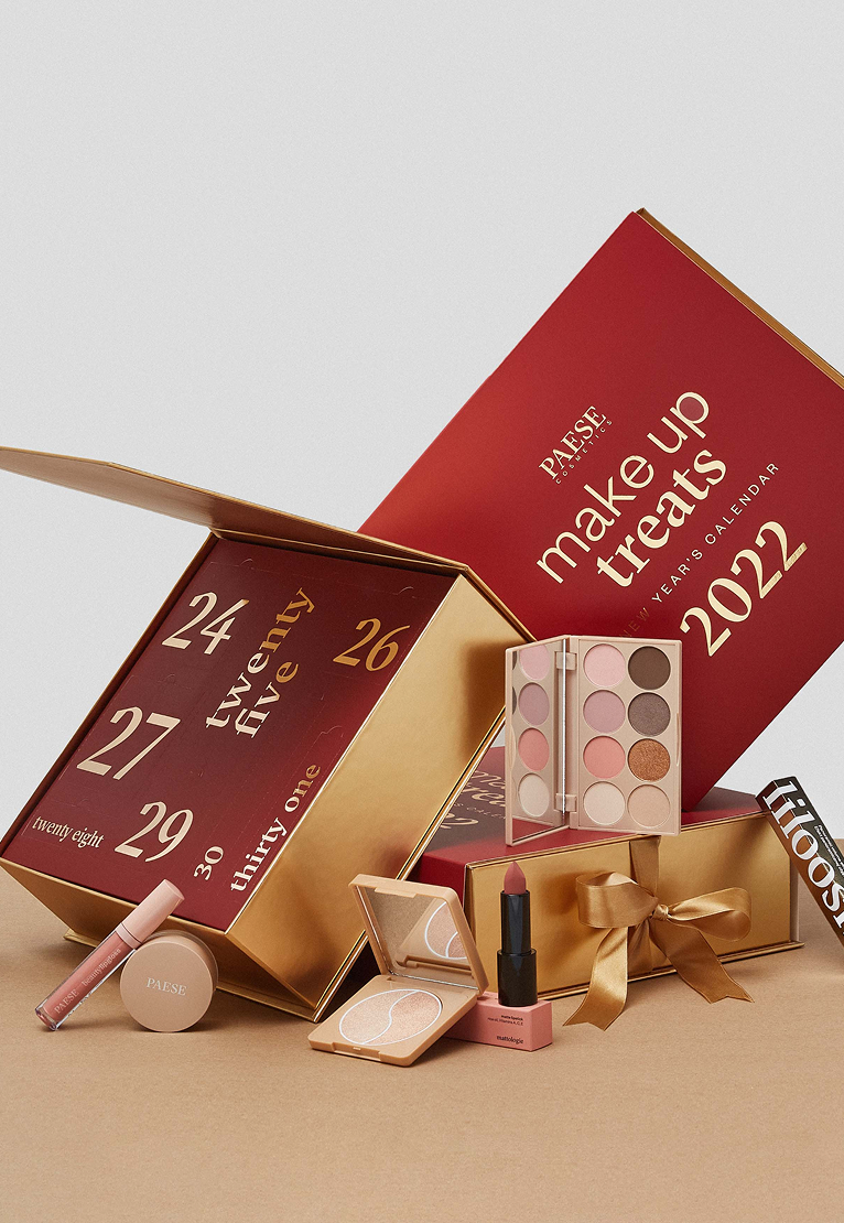
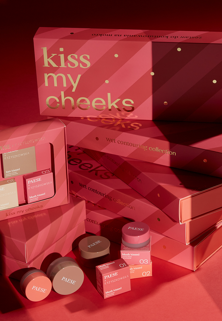
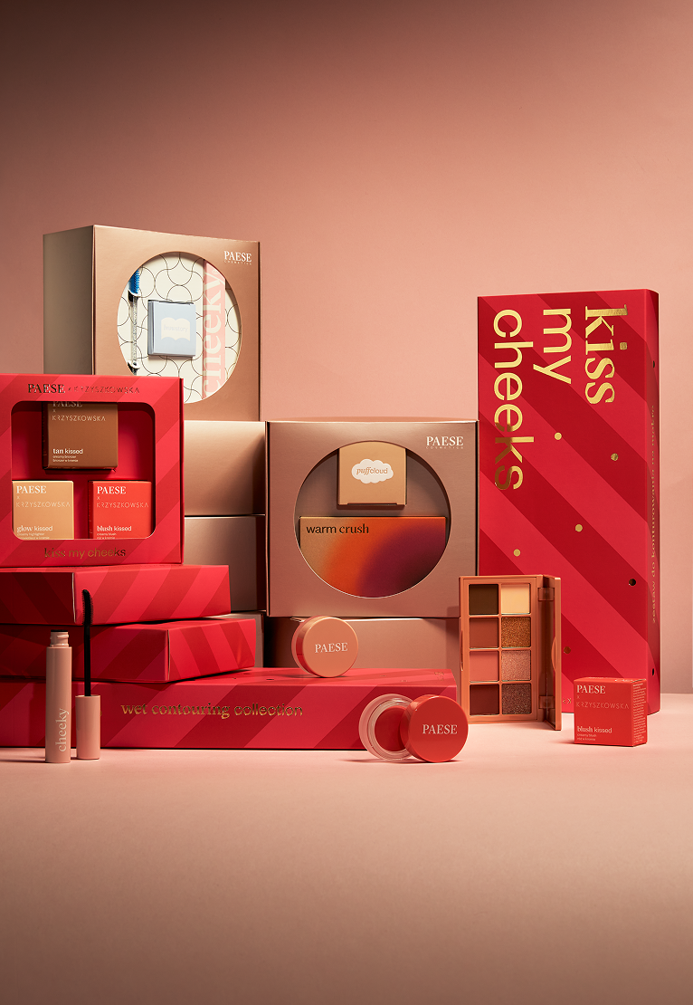


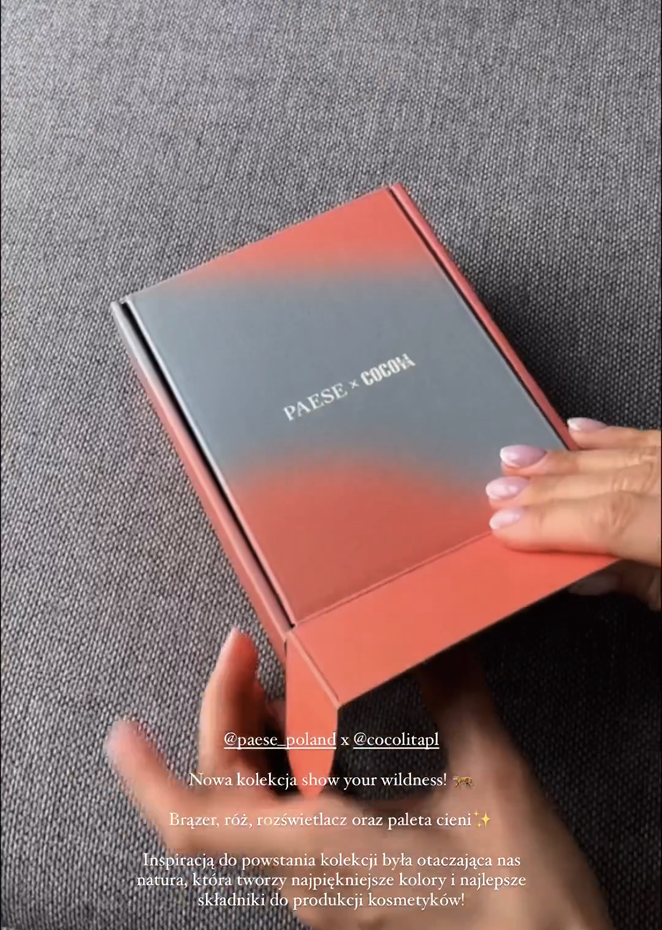
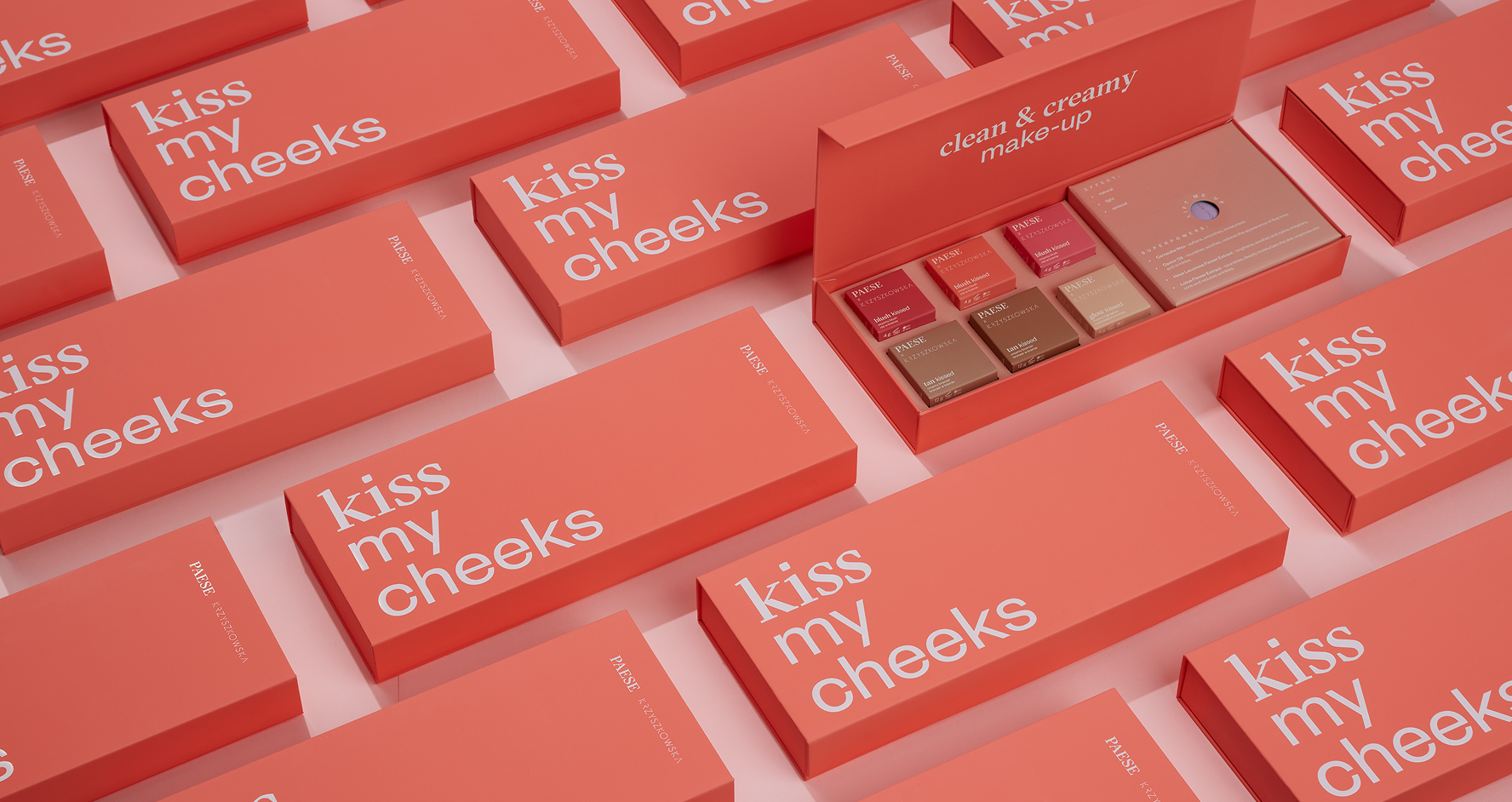
We took care of PR boxes, christmass boxes, limited edition boxes, pretty much… all the boxes.
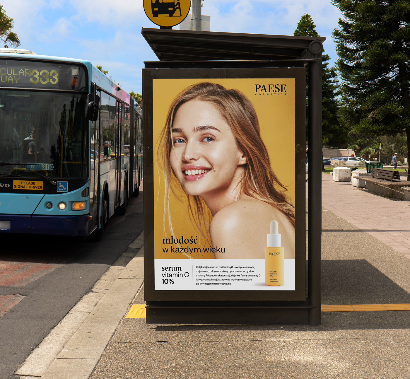
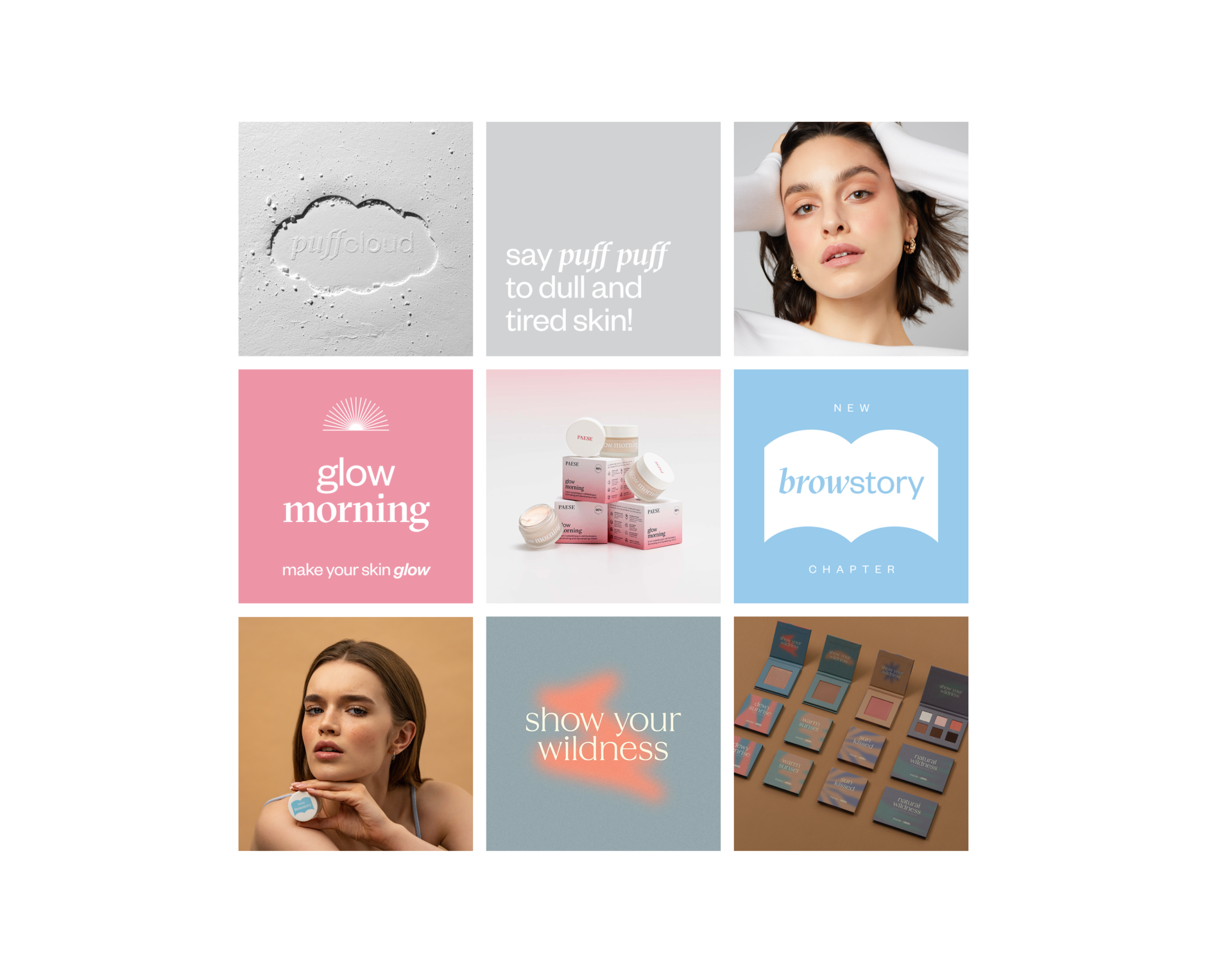
From photoshoot art direction to posters, flyers and social media posts, e-commerce and landing page designs we extended the visual language across every touchpoint, creating a full brand experience.

Art Direction – Dawid Prząda, Paulina Suchinska
Design Team – Dawid Prząda, Paulina Suchińska, Ewa Jakubowska, Katarzyna Klebert
Renders – Bartek Suski
Photos – Paese Cosmetics Archive
like it? get in touch!
hello@widok.studio
hello@widok.studio